Design comparison
Community feedback
- @arifa-iqbalPosted 4 months ago
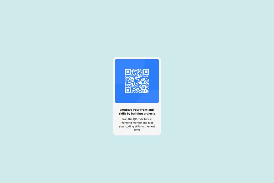
The solution makes good use of basic HTML elements like <div>, <h1>, and <p>, but there’s room to improve by incorporating more semantic tags such as <main> for better accessibility and structure. For example, wrapping the QR code in a <figure> tag could provide a clearer context. Additionally, adding alt text to the QR code image would help screen readers, improving accessibility. You should also verify the color contrast ratios to ensure they meet WCAG guidelines, as this can affect readability, especially with light text on light backgrounds. The layout is responsive, particularly with Flexbox, but testing across different devices is essential to ensure proper alignment and spacing. Fine-tuning your media queries for smaller screens will ensure the card resizes appropriately. The code is generally clean, but adding comments to explain sections and following a consistent naming convention for CSS classes will improve readability and make the code easier to maintain. Thinking about reusability by extracting common styles into variables or classes would be beneficial for future updates. Make sure the design closely matches the provided mockup, paying attention to padding, margins, and alignment around the QR code. Lastly, ensure that all text remains legible, especially on smaller screens, and consider adjusting line heights for better readability.
1 - P@Islandstone89Posted 4 months ago
HTML:
-
Every webpage needs a
<main>that wraps all of the content, except for<header>andfooter>. This is vital for accessibility, as it helps screen readers identify a page's "main" content. Change.maininto a<main>. -
The alt text must also say where it leads(the frontendmentor website). A good alt text would be "QR code leading to the Frontend Mentor website."
-
I would change the heading to a
<h2>- a page should only have one<h1>, reserved for the main heading. As this is a card heading, it would likely not be the main heading on a page with several components. -
Change "Scan the QR code" to a
<p>, as it is not a heading. -
There is no need to wrap every card element in a
<div>- you only need one<div>that holds all the elements. Ideally, your HTML should look like this:
<main>
  <div class="card">
    <img  class="photo" src="assets/images/image-qr-code.png" alt="QR code leading to the Frontend Mentor website.">
    <h2>Improve your front-end skills by building projects</h2>
    <p>Scan the QR code to visit Frontend Mentor and take your coding skills to the next level</p>
  </div>
</main>
CSS:
-
Including a CSS Reset at the top is good practice.
-
Use the style guide to find the correct
font-family, and remember to specify a fallback font:font-family: 'Outfit',sans-serif; -
Use the style guide to find the correct
background-color. -
I recommend adding a bit of
padding, for example16px, on thebody, to ensure the card doesn't touch the edges on small screens. -
Move the styles on
.maintobody. -
On the
body, changeheighttomin-height: 100svh- this way, the content will not get cut off if it grows beneath the viewport. -
Remove the margin on the card. It is already centered using Flexbox.
-
Remove all widths and heights in
px. We rarely want to give a component a fixed size, as we need it to grow and shrink according to the screen size. -
We do want to limit the width of the card, so it doesn't get too wide on larger screens. To solve this issue, give the card a
max-widthof around20rem. -
font-sizemust never be in px. This is a big accessibility issue, as it prevents the font size from scaling with the user's default setting in the browser. Use rem instead. -
Since all of the text should be centered, you only need to set
text-align: centeron the body, and remove it elsewhere. The children will inherit the value. -
On the image, add
display: block,height: autoand changewidthtomax-width: 100%- the max-width prevents it from overflowing its container. Without this, an image would overflow if its intrinsic size is wider than the container.max-width: 100%makes the image shrink to fit inside its container. -
I would increase the
paddingon the card to16px.
0 -
Please log in to post a comment
Log in with GitHubJoin our Discord community
Join thousands of Frontend Mentor community members taking the challenges, sharing resources, helping each other, and chatting about all things front-end!
Join our Discord
