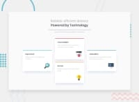
Design comparison
SolutionDesign
Solution retrospective
More flex stuff.
I hope we're all better for this now.
Community feedback
- @maligaurav947Posted over 2 years ago
Hey There, Love The Solution Every think is good but background-color of the page looking different and the size of the object is big all the best for next one
happy coding ❤
0
Please log in to post a comment
Log in with GitHubJoin our Discord community
Join thousands of Frontend Mentor community members taking the challenges, sharing resources, helping each other, and chatting about all things front-end!
Join our Discord

