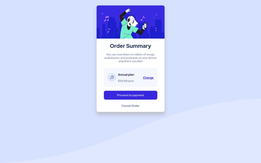
Design comparison
SolutionDesign
Solution retrospective
I did the best I could, my solution is with flexbox and media queries, I think the result is good. Any feedback is welcome :)
Community feedback
- @vanzasetiaPosted over 3 years ago
👋Hi Antony!
👍Good job on completing this challenge!
I hay some feedback on this solution:
- The card is almost has full width on mobile view (360px * 640px). Try to add
paddingon yourbodyelement. - I noticed that the HTML
langattribute has valuees, which is Español based on what I see on MDN about lang attribute. The problem is that, the current page has English language not Spanish. So, I recommend to keep value of thelangattribute withen. - The
Proceed Paymentshould have bolder font weight. - For any decorative images, which in this case, all images are decorations only. You should leave the
alt=""empty and addaria-hidden="true"orrole="presentation", to make sure all screen readers ignore those images. - Also the alt (Alternative text) should not be hyphenated. It should be descriptive for human to read.
Order Summaryshould be a heading tag. It is the title of the card.- You should wrap all your page content with
maintag. I'm not sure why Frontend Mentor doesn't report any accessibility issues. - Are trying to make all elements set to
box-sizing: border-box? If so, you should addbox-sizingproperty to thehtmlelement.
*, *:after, *:before{ box-sizing: inherit; } html { box-sizing: border-box; }- You should never change the root font size. I recommend to keep the default behavior to make sure that every device and browser will render the size correctly.
- The
bodyfont size should also useremunit.
That's it! Hopefully this is helpful!
0 - The card is almost has full width on mobile view (360px * 640px). Try to add
Please log in to post a comment
Log in with GitHubJoin our Discord community
Join thousands of Frontend Mentor community members taking the challenges, sharing resources, helping each other, and chatting about all things front-end!
Join our Discord
