Design comparison
Solution retrospective
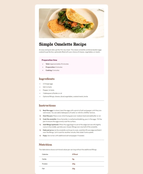
I did the project without a design file for figma, I did everything by eye, there were problems with indents and dimensions.
What specific areas of your project would you like help with?Any advice or comments would be appreciated.
Community feedback
- @Fender60Posted 2 months ago
Thank you so much for your advice, your feedback is useful for me. Good luck to you.
0 - @DacardonacPosted 2 months ago
Hello Fender60,
I hope you're doing well. I reviewed your solution and want to congratulate you on your great work. I also noticed a few areas for improvement, and I'd like to share some feedback with you:
SEO: Adding Metadata to your HTML can help improve your page's SEO and boost its visibility in search engines. Metadata and SEO
Performance: I recommend using
.webp
format for images, as it will enhance your project's Performance.HTML Semantics: Your HTML could benefit from better Semantic Structure. Here’s a link to help you improve this aspect: Semantic in HTML.
Version Control: It's a good idea to make Commits whenever a part of the project is complete. This acts as a Checkpoint, allowing you to avoid losing progress if something goes wrong.
Sass and Components: I noticed you're using Sass for styling, which is excellent. To keep your Styles organized, consider breaking them into Components to prevent files from getting too large. Here’s a link to read more about it: Sass Guide.
README: You've used the
README-template.md
from Frontend Mentor, which gives your project a professional touch in the README File.Keep up the good work and good luck!
0
Please log in to post a comment
Log in with GitHubJoin our Discord community
Join thousands of Frontend Mentor community members taking the challenges, sharing resources, helping each other, and chatting about all things front-end!
Join our Discord