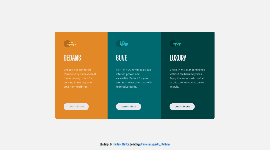
Design comparison
Solution retrospective
For me it was the easiest. But there is always something to improve. Tell me anything, it all adds up
Community feedback
- @ChamuMutezvaPosted over 2 years ago
Hi Agustin
Well done, this looks good.
- i think the buttons should be anchor elements, they are links to a section or page for
learn moredetails. Buttons are normally used for click events related to opening modals, toggle events among others whilst an anchor is reserved for navigation.
Marked as helpful1@agusc01Posted over 2 years agoHi Chamu. I made the changes. Now the buttons are anchors. ;) Thanks your time !
0 - i think the buttons should be anchor elements, they are links to a section or page for
- @zDevtutorPosted over 2 years ago
Hey @aqusc01, Well done on the project here!. There are some improvements regarding the responsive part. The footer gets overlaps with the cards on some mobile devices. You could try to use the browser developer tool to check on that. On the medium screens between 700 to 900px the grey background doesn't fill the full width and height of the browser. I think by solving these two issues you're improving the project a lot.
Marked as helpful1@agusc01Posted over 2 years agoHi @zDevtutor
I fixed the things you told me (I increased the height of main tag). I've worked on my computer and on my mobile phone, but I didn't see the problems between 700 to 900px. Thanks a lot .
0 - @shashreesamuelPosted over 2 years ago
Hey agusc01, good job completing this challenge. Keep up the good work
Your solution looks good I can't see anything to change
Let's talk about your accessibility issue, simply wrap all your content between
<main>tags to fix your accessibility issue.I hope this helps
Cheers Happy coding 👍
0
Please log in to post a comment
Log in with GitHubJoin our Discord community
Join thousands of Frontend Mentor community members taking the challenges, sharing resources, helping each other, and chatting about all things front-end!
Join our Discord
