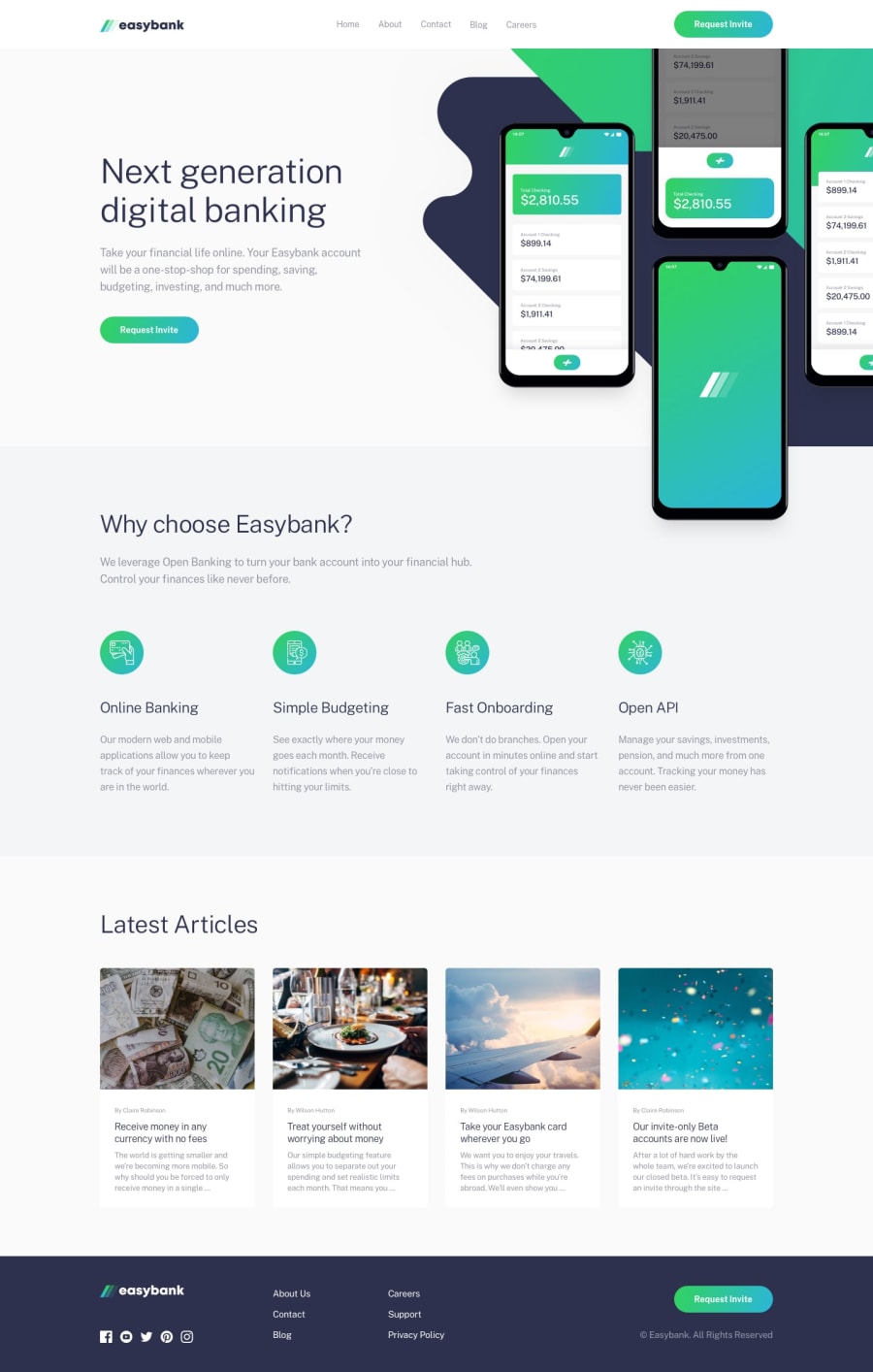
Design comparison
SolutionDesign
Solution retrospective
The hero section of the page was a major challenge, especially the right side of the section which includes the background image and the actual image in terms of responsiveness. any alternative way to tackle the problem?
Community feedback
Please log in to post a comment
Log in with GitHubJoin our Discord community
Join thousands of Frontend Mentor community members taking the challenges, sharing resources, helping each other, and chatting about all things front-end!
Join our Discord
