

Design comparison
SolutionDesign

Solution retrospective
What are you most proud of, and what would you do differently next time?
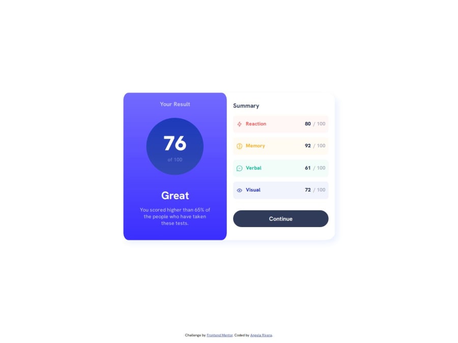
Most proud of the different colored elements in the second half of the component. I'm happy with how they look and how they came out.
What I would do differently is how I coded them because I feel like I was very repetitive with how I did it. I hope to learn more ways to code that so that my code is more condensed and less repetitive.
What challenges did you encounter, and how did you overcome them?I had difficulties with the gradients and getting them to match the design. I still think they are off, especially the circle. I tried a few things using different colors and opacity but I stuck with the one that was the closest to the design.
Community feedback
Please log in to post a comment
Log in with GitHubJoin our Discord community
Join thousands of Frontend Mentor community members taking the challenges, sharing resources, helping each other, and chatting about all things front-end!
Join our Discord