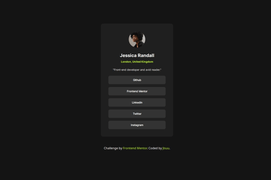
Not Found
Not Found
Not Found
Not Found
Not Found
Not Found
Not Found
Not Found
Not Found
Not Found
Not Found
Not Found
Not Found
Not Found
Not Found
Not Found
Not Found
Not Found
Not Found
Not Found

Submitted

Flexbox responsive social profile.

P
tjnut3 70

@tjnut3

Desktop design screenshot for the Social links profile coding challenge

This is a solution for...

  • HTML
  • CSS
1newbie
View challenge

Design comparison


SolutionDesign

Solution retrospective


What are you most proud of, and what would you do differently next time?

I very pround in fade hover in every social media link. and i have a liitle bit improve on flexbox for responsive website.

What challenges did you encounter, and how did you overcome them?

It's direction of flexbox. this time i have to change it to horizontal direction.

What specific areas of your project would you like help with?

I don't know why in live server my profile doesn't show in the middle of my screen. i try on every resolution before uploaded and it don't have any ploblem.

Community feedback

MikDra1 6,090

@MikDra1

Posted

Great job on the code! Here are a few suggestions:

  • The use of box-sizing: border-box; for all elements ensures that padding and borders are included in the element's total width and height, which helps prevent layout issues.

  • Defining custom fonts with @font-face is well done. Consider combining similar font definitions to reduce redundancy. Make sure the font files are optimized for web performance.

  • The body background color #f4d04e is vibrant and effective. Setting width: 100%; ensures the body takes up the full viewport width.

  • Using Flexbox to center the .container is effective, but the fixed height of 60rem might cause issues on smaller screens. Consider using min-height or a responsive unit for better adaptability.

  • The .main-card design with border, box-shadow, and border-radius looks modern and clean. Be mindful of the fixed width and ensure it doesn't affect responsiveness. Using percentage-based widths or max-width could improve flexibility.

  • The .text-card styles for headings and links are well thought out. Ensure text color provides good contrast for readability. The hover effect on links changing color to #f4d04e adds a nice touch.

  • The .author-card styling with Flexbox for alignment is effective. Ensure image sizes and spacing are consistent across devices.

Hope you found this comment helpful 💗💗💗

Good job and keep going 😁😊😉

Marked as helpful

0
P
Steven Stroud 4,140

@Stroudy

Posted

Awesome job tackling this challenge! You’re doing amazing, and I wanted to share a couple of suggestions that might help refine your approach…

  • Your heading elements are <h1><h2><h4> missing <h3>, Heading elements should be in sequentially-descending order (e.g., <h1>, <h2>, <h3>) to create a clear content structure, improving accessibility and SEO. Skipping levels or using them out of order can confuse screen readers, affect search engine rankings, and make your content harder to understand.

  • Having a clear and descriptive alt text for images is important because it helps people who use screen readers understand the content, making your site more accessible. It also improves SEO, as search engines use alt text to understand the image's context, helping your site rank better, Check this out Write helpful Alt Text to describe images,

  • Using font-display: swap in your @font-face rule improves performance by showing fallback text until the custom font loads, preventing a blank screen (flash of invisible text). The downside is a brief flash when the font switches, but it’s usually better than waiting for text to appear.

  • Developers should avoid using pixels (px) because they are a fixed size and don't scale well on different devices. Instead, use rem or em, which are relative units that adjust based on user settings, making your design more flexible, responsive, and accessible. For more information check out this, Why font-size must NEVER be in pixels or this video by Kevin Powell CSS em and rem explained.- Another great resource for px to rem converter.

You’re doing fantastic! I hope these tips help you as you continue your coding journey. Stay curious and keep experimenting—every challenge is an opportunity to learn. Have fun, and keep coding with confidence! 🌟

Marked as helpful

0

Please log in to post a comment

Log in with GitHub
Discord logo

Join our Discord community

Join thousands of Frontend Mentor community members taking the challenges, sharing resources, helping each other, and chatting about all things front-end!

Join our Discord