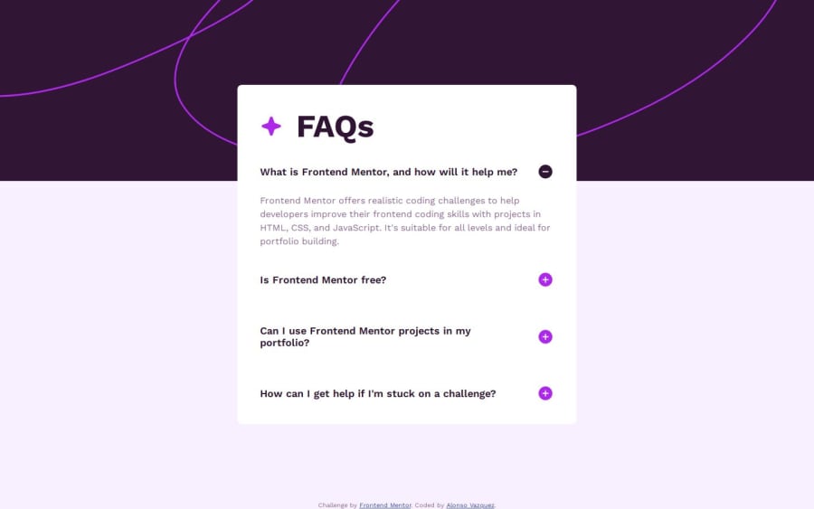
Design comparison
SolutionDesign
Solution retrospective
What are you most proud of, and what would you do differently next time?
I think one of the things I feel most proud of is basically being able to build something like this in almost no time. I think that I'm starting to improve my coding skills.
What challenges did you encounter, and how did you overcome them?One of the challenges definitely was to think about a semactic element in HTML5 that helps me to accomplish this challenge a bit faster. After I found the one I just needed small tweaks to make it look like the designs and the best of all, with almost no JS at all!
Community feedback
Please log in to post a comment
Log in with GitHubJoin our Discord community
Join thousands of Frontend Mentor community members taking the challenges, sharing resources, helping each other, and chatting about all things front-end!
Join our Discord
