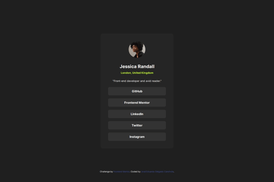
Design comparison
Community feedback
- P@kaamiikPosted 5 months ago
Hi. Congrats for doing this challenge.
I saw in your html you have used
mainandfooterand It is so good. Your base structure is good but I think there is no need forarticleandsectionhere. This is a card as I see. I think It's better using adivfor your card container and the parts that is need use adivfor wrap some group of elements to use fordisplay: flex;or other things. But remember usingdivas needed. Here there is no need to wrap your image in asection. Or there is no need to wrap a singleptag in asection. Also for your link items It's better to useulwithlifor each link.On your CSS:
- Try to use a proper CSS reset at the start of your CSS style. Andy Bell and Josh Comeau both have a good one. You can simply search on the internet to find them.
- Use
min-height: 100vh;instead ofheight:100vh;.height: 100vhstrictly limits the height to the viewport size, potentially causing overflow issues if the content is larger than the viewport. On the other hand,min-height: 100vhallows your element to grow in height if the content exceeds the viewport size.
- width: 384px; is wrong. Never limit your width and height in a container or element or tag that contains text inside. When you limit the width and height of elements containing text, you risk the text being cut off, overflowing, or becoming unreadable, especially on smaller screens or when the text dynamically changes.
It's generally better to allow the container to adjust its size based on its content or set a flexible size that can adapt to different screen sizes and text lengths. You only need
max-widthhere because it prevents elements from stretching beyond a certain point, keeping them visually appealing across different screen sizes. It ensures your design remains adaptive and doesn't get too wide on larger screens.
- Your
font-sizeandmax-widthshould be inremunit notpx. You can read this article about it and why you should not usepxas a font-size.
- There is no need using
position: relative;for thebodyand also absolute positioning for your footer. I didn't understand why you used it.
Marked as helpful0@grace-snowPosted 5 months ago@kaamiik I agree with all of this - great feedback! And I can confirm I am seeing very bad overflow bugs on mobile because of the height 100vh limit that's been set. It's noticeable on my phone on portrait but becomes severe on landscape view when half the card disappears. @jedcanchola definitely change to min-height 100vh (or 100svh if you want to use the newer units).
I also see the attribution content overlapping the card content. Don't use position absolute on that. Just let it sit where it sits naturally.
The only other extra suggestion is to give the image a width and height. You can do that in html or css, your choice. If using css add in
aspect-ratio: 1. For images that you know you always want to have a fixed size or aspect ratio it helps performance to let the browser know. Then the browser saves space for the image as its loading.Marked as helpful1
Please log in to post a comment
Log in with GitHubJoin our Discord community
Join thousands of Frontend Mentor community members taking the challenges, sharing resources, helping each other, and chatting about all things front-end!
Join our Discord
