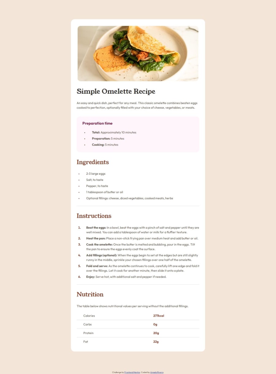
Design comparison
Solution retrospective
Most proud of moving from the mobile to desktop designs. Had a much easier time making the transition than in other projects.
I would group together blocks of css to decrease on repetition. I did a bit of that but definitely should have done more to condense code.
What challenges did you encounter, and how did you overcome them?Trying to figure out the spacing between the list markers and the text was new for me so I had to look that up. I was a bit confused with were to add padding and margins but Chrome inspector helps out a lot with that.
Community feedback
- @lawlawsonPosted 12 months ago
Really good implementation here, there are a few challenges to this one that makes it a lot harder than it looks. Great job here in implementation for both mobile and desktop, your code is very well structured and easy to read!
1@ang-rivPosted 12 months agoThanks! I wanted to make sure that it was organized so that I can go back and find things quicker when I want to change something. I have a tendency to get confused in my own code lol @lawlawson
1
Please log in to post a comment
Log in with GitHubJoin our Discord community
Join thousands of Frontend Mentor community members taking the challenges, sharing resources, helping each other, and chatting about all things front-end!
Join our Discord
