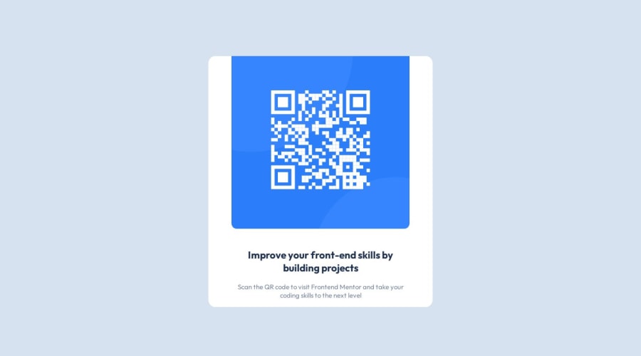
Not Found
Not Found
Not Found
Not Found
Not Found
Not Found
Not Found
Not Found
Not Found
Not Found
Not Found
Not Found
Not Found
Not Found
Not Found
Not Found
Not Found
Not Found
Not Found
Not Found

Submitted

Flexbox QR

@Poyoanon

Desktop design screenshot for the QR code component coding challenge

This is a solution for...

  • HTML
  • CSS
1newbie
View challenge

Design comparison


SolutionDesign

Solution retrospective


  • Maybe I should've used bootstrap for this? I just rawdogged it with no libraries...
  • Trying to make the container mobile-friendly and responsive is really difficult without any help from libraries. On mobile, it doesn't neatly fit it all on a single screen, you have to scroll down a little. How could I have done it better?
  • I'm wondering if my CSS code is a little messy, I am mostly self-taught and I'm unsure of what is considered best practice when it comes to that.

Community feedback

Brendon 70

@bcrave

Posted

Congrats on completing the challenge! 🍾

Responsive styling can certainly be hard, but you did a great job! 👏

Hopefully I have some insights that might make it easier in the future. You totally don't need to use bootstrap for this task, and, in fact, I think it's easier without it.

When I'm working on styling a component, I usually employ one of two approaches:

  • Top-down approach
  • Bottom-up approach

Top-down Approach

  • First, determine the dimensions of the top-level container of your component. In this case, that's going to be the section with a class name of container. I'm not using Figma or Sketch, so I'll just open up the design jpeg in the Preview app on my Mac and use the "rectangular selection" tool to find these dimensions. I'll usually round it down to the nearest 10 as well.
  • Once you have your outermost container's dimensions set, you can determine the width of its first child, which, in this case, is your image. You can figure out the width of the image by measuring the space between the image and the edge of the outer container div. Once again, use the rectangle selector to measure this.
  • Once I know that distance, I'll actually add it as padding inside the container div. That way you can just make the inner elements/containers 100% and they'll maintain that distance. NOTE: If you adjust only the width of an image, it will maintain its aspect ratio, so there is no need to also adjust the height.
  • From there, you just keep working inwards

Bottom-up approach

  • Start by determining the width of your innner-most element. If there are more than one, choose the one that is wider or taller, depending on the orientation of your component. In this case it's going to be the QR-code image, and we want to know its width. Once you've determined its width, simply set it in CSS.
  • Do the same thing as with the top down approach, where you measure the distance between your image element and the edge of its wrapper element, and make that the padding of the wrapper element. Notice with this approach you are still adding padding to the wrapper rather than margin to the image. This is because you want the same padding to apply to your other elements as well.

The difference between these two approaches is essentially which elements you are going to hard-code your dimensions to, and which elements you are going to make relative to those dimensions. So, in the top-down approach, you hard-code the size of the outer container, and make the child elements relative to that. With the bottom-up approach, you hard-code the size of the inner elements, and then make the size of the container relative to that. However, in both cases, you are using padding to determine those relative sizes.

Applying top-down to your component

  • I observed that when I took all the styles off of your component in Chrome's dev tools, your component was already 90% of the way there. All I added back in was:
.container {
background-color: white;
}
  • I then changed the height and width to width: 20rem and height: 31.25rem.
.container {
background-color: white;
+ width: 20rem;
+ height: 31.25rem;
}
  • Then I added padding:
.container {
background-color: white;
width: 20rem;
height: 31.25rem;
+ padding: 1rem;
}
  • At this point, your image seems to be in place, and so does the description, but I'll refactor the description to be consistent with our approach. I'll do this by replacing the margin with padding:
.description {
/* your other styles */
- margin: 0 10% 10% 10%;
+ padding: 0 1rem;
}

From there, you can just add your border radius and whatnot. I hope this helps and doesn't feel like I'm telling you exactly how to do it! There are many ways to complete these tasks, but these are just tips I've picked up along the way myself and have found them to be consistently helpful. Best of luck! 🍀

Marked as helpful

0
Steve 1,170

@peanutbutterjlly

Posted

hey 👋,

I would avoid using a CSS library/framework while first learning CSS - you'll learn a lot more and be able to successfully utilize a framework once you have the basics down.

In regards to your styles, it looks like you put on too many properties/rules in your CSS - in general, html is already 'responsive' as is, it's adding set heights/widths/margins/padding/etc. that make things less responsive.

to help with your styles, I suggest starting with these base styles and add/tweak to your taste (note: I removed quite a few styles from what you had set on these classes):

.container {
background-color: white;
display: flex;
max-width: 300px;
align-items: center;
flex-direction: column;
border-radius: 3%;
}

.qr {
max-width: 90%;
border-radius: 3%;
margin-block: 5%;  // short-hand logical property to add margin to 'top' and 'bottom'
}

.qr img {
width: 100%;
border-radius: 3%;
}

overall good job with completing the solution! keep up the good work 👍

Marked as helpful

0
Tushar Biswas 4,080

@itush

Posted

Congratulations on completing the challenge! 🎉

Welcome to the platform! 🎉 We're thrilled to have you here and excited to see your progress 💪as you continue your front-end development journey.

Your solution looks nice to me :)

In my projects:

  • I always start with mobile-first workflow.
  • I use at least one main element for a page (entire content goes into the main, if I'm not using header & footer), and avoid divs as much as possible and use section and article element wherever I can.
<body>
<main>
All content 
</main>
</body>
  • I Use relative units as much as possible and avoid absolute units whenever possible.
  • If you are someone who is just starting out with front-end development, I strongly suggest starting with the QR code component project(which you did). Also in the challenges page you may filter by (Newbie, HTML&CSS) sort by (easier first) to select projects that will help you solidify your foundation. To avoid any potential knowledge gap⚠️ please first solidify HTML, CSS, JS fundamentals and then move on to any framework or library.
  • I remember when I started out, I made countless mistakes and spent long hours searching for solutions. But hey, you don't need to go through the same struggles! 🙌 To help you shorten the learning curve, I recommend going through the following articles. They contain valuable insights that can make your journey smoother:

📚🔍 12 important CSS topics where I discuss about css position, z-index, box-model, flexbox, grid, media queries, mobile-first workflow, best practices etc. in a simple way.

📚🔍 11 important HTML topics where I discuss about my thought process and approach to convert a design/mock-up to HTML along with other topics.

I hope you find these resources helpful in your coding adventures! 🤞

I'm eagerly looking forward to seeing the amazing projects you'll create in the future! 🚀💻

Keep up the fantastic work and happy hacking! 💪✨

Marked as helpful

0

Please log in to post a comment

Log in with GitHub
Discord logo

Join our Discord community

Join thousands of Frontend Mentor community members taking the challenges, sharing resources, helping each other, and chatting about all things front-end!

Join our Discord