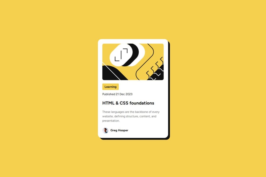
Design comparison
SolutionDesign
Solution retrospective
What are you most proud of, and what would you do differently next time?
I believe i got the card to look quite similar to the reference. Also testing the responsiveness on smaller screen, it appears to be working fine.
What challenges did you encounter, and how did you overcome them?I find it hard to get the text to look the way it did in the reference picture, with regards to sizing etc. Also find importing the fonts from the included files difficult.
What specific areas of your project would you like help with?I would love to get some clarification on how to correctly import the variable fonts into my css.
Join our Discord community
Join thousands of Frontend Mentor community members taking the challenges, sharing resources, helping each other, and chatting about all things front-end!
Join our Discord
