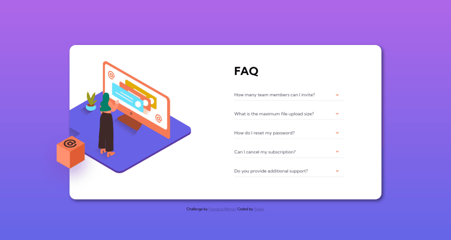
Design comparison
Solution retrospective
Hello All ,
Could I get some feedback ?
I wasn't able to deal with one of the background on the desktop mode and couldn't manage the behavior of the women on desktop when a question is hide / show . I don't know if it is normal.
I struggle with the box and women on desktop the overflow method haven't work like I would so I got some help with google :)
It not fully responsive under 600px.
In hope that someone can help me !
Thanks for reading !
Community feedback
- @Sdann26Posted over 2 years ago
Hi Yokke!
To be honest I don't think my comment will help much because personally I would change a lot of things but I'll tell you the picture I have.
On the one hand I would recommend you to use the <summary> and <details> tags, these by default have the toggle effect that you are looking for in this challenge and with JS you can control that when you click on one the others are closed and thus in addition to remove and give the classes for when a question has been selected.
If you want you could see the solution I made for this challenge using those tags, also pseudo elements for the arrow and the CSS effects to make it rotate as well as the text appear and fade.
On the other hand I see no need for the <article>. Remember that <section> and <article> are tags to encompass sections of the web but are sections with the same theme does not make sense to use them in a component as they all follow the same theme of questions so I would recommend not to abuse these classes also then you will jump accessibility errors like this in your report.
The intention has been quite good but there are things that you can improve to make it perfect. I hope my comment can serve you even a little bit as a guide.
0@JexintePosted over 2 years ago@Sdann26 Thanks for sharing your opinion I know the <details> tag but never use it for a project and the summary I wasn't aware of his existence until now.
I just check how it looks on your live preview I don't want to check the code now I'll do another try later with your recommandation then check your code after submission
I think I understand what you are saying about <section> and <article> ( I'm not english native) I honestly I'm using many section because I don't want to abuse of <div> because it seems meaningless for semantics so I'm trying many to deal on how use properly tag for the right content It's not easy some time
For the arrow I was thinking at the time using the rotate property to make the arrow effect it's a good property for this effect no ?
You helped me a lot !
1@Sdann26Posted over 2 years ago@Jexinte About the date, if it is a good idea to use transformr, rotation. On the other hand it is true that it is not good to abuse div but as long as you use them to add necessary styles there is no problem. At the end they were created with that sense to be able to give styles.
As long as you can use semantic tags use them because it is its main use and improves the positioning and reading of your website.
Marked as helpful1
Please log in to post a comment
Log in with GitHubJoin our Discord community
Join thousands of Frontend Mentor community members taking the challenges, sharing resources, helping each other, and chatting about all things front-end!
Join our Discord
