Design comparison
SolutionDesign
Solution retrospective
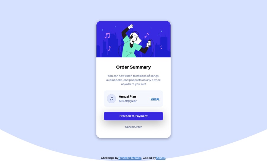
This one was fun. I think it turned out nicely. I wanted to use 2 anchors on as the payment and cancel button, but for some reason they kept overlapping over each other.
Community feedback
- @correlucasPosted over 2 years ago
👾Hello Coley, congratulations for your solution!
Your solution seems really great and you've done a good wrapping all the content inside the main div. You've missed only the background thats not aligned properly due the lack of
min-heightandbackground-size: containin the body. See the code fixes below:body { min-height: 100vh; background-image: url(images/pattern-background-desktop.svg); background-repeat: no-repeat; background-color: #edf4ff; background-size: contain; }Hope it helps and happy coding!
Marked as helpful1@KoruxxPosted over 2 years ago@correlucas thank you, Lucas. I really appreciate your help! 😄
1
Please log in to post a comment
Log in with GitHubJoin our Discord community
Join thousands of Frontend Mentor community members taking the challenges, sharing resources, helping each other, and chatting about all things front-end!
Join our Discord
