Design comparison
SolutionDesign
Solution retrospective
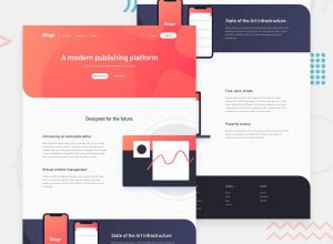
So I thought this would be the easiest challenge ever, but then background image positioning and size gave me a real one. I fought some but I need help. The service section (dark background with the phone images) isn't looking good.
Community feedback
Please log in to post a comment
Log in with GitHubJoin our Discord community
Join thousands of Frontend Mentor community members taking the challenges, sharing resources, helping each other, and chatting about all things front-end!
Join our Discord
