flexbox, media queries, transition, animate, javascript etc
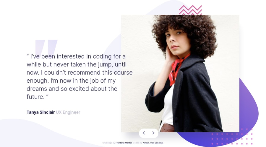
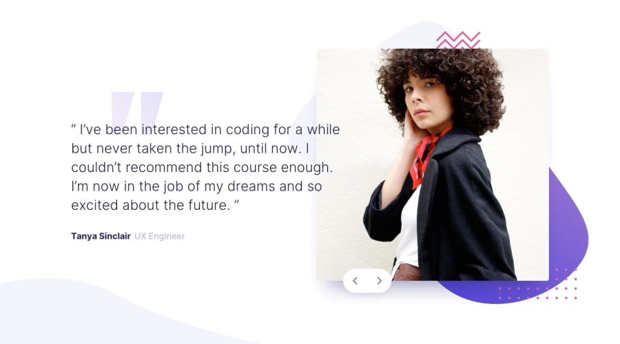
Design comparison
Solution retrospective
I had trouble positioning the bg-curve image for the mobile devices, and would love to get a bit of advice on positioning it the right way.
Community feedback
- @palgrammingPosted over 3 years ago
look at the photos of the people then drag your browser wider and then push it back narrow and watch how the positions of the photo of the people and the elements behind it change. It does not seems you are attaching everything to the same component because they are not sticking together
0@AngelusLovellPosted over 3 years ago@palgramming Thank you for ur feedback, I appreciate it. Yes, I did not attach my background image to the same element. I did not consider it was important but I do now. I will keep in mind to make my design have a continuous and smooth transition when it changes from screen to screen. Thank you.
0
Please log in to post a comment
Log in with GitHubJoin our Discord community
Join thousands of Frontend Mentor community members taking the challenges, sharing resources, helping each other, and chatting about all things front-end!
Join our Discord
