Design comparison
SolutionDesign
Solution retrospective
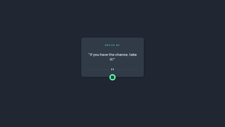
The dice button was difficult to position. I'm pretty sure I didn't do it the right way. I would like some help with it if possible.
Community feedback
- @stijnmeershoekPosted over 2 years ago
The proper way to position the dice button would be to have a position: relative on the container of the button, then add a positon: absolute on the button. and add a bottom of half the height of the button. like below. if you need more info on why it works this way i'll be happy to help.
.container {
  position: relative;
}

button {
  position: absolute;
  bottom: -30px;
  height: 60px;
}
1
Please log in to post a comment
Log in with GitHubJoin our Discord community
Join thousands of Frontend Mentor community members taking the challenges, sharing resources, helping each other, and chatting about all things front-end!
Join our Discord
