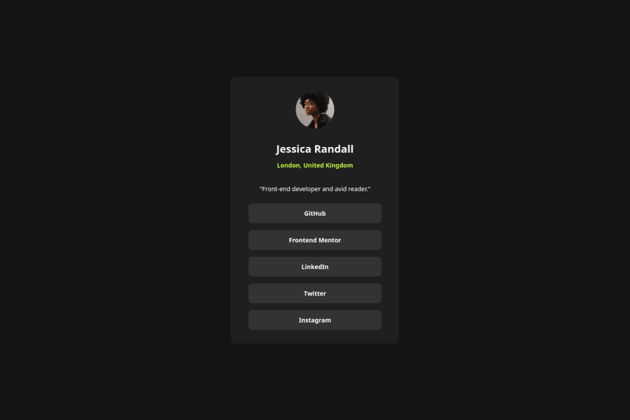
Design comparison
SolutionDesign
Solution retrospective
What are you most proud of, and what would you do differently next time?
Overall, it was a straightforward exercise. I want to customize and implement it into a digital business card or profile soon. Next exercise I will start dipping my toes into Sass.
What challenges did you encounter, and how did you overcome them?I feel I am getting a better understanding of the sizing and CSS organization. But at the beginning while styling the Mobile design, the spacing through me for a good loop around.
What specific areas of your project would you like help with?Best practices for clean and efficient code are always welcome.
Community feedback
Please log in to post a comment
Log in with GitHubJoin our Discord community
Join thousands of Frontend Mentor community members taking the challenges, sharing resources, helping each other, and chatting about all things front-end!
Join our Discord
