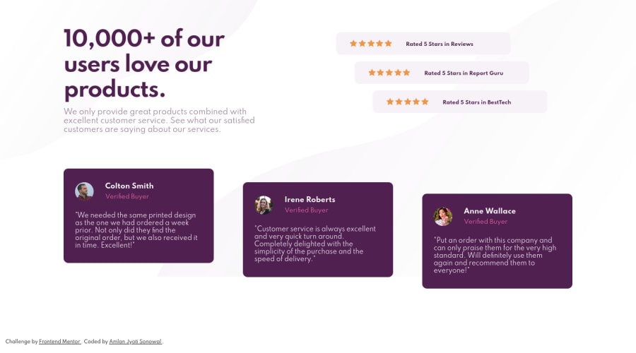
Design comparison
Solution retrospective
Any advice on organizing the code ?
Community feedback
- @dwhensonPosted over 3 years ago
Hi @ShashaGazem nice work on this one! 🙌 It's not an easy one. I found it very tricky to get everything aligned up where it should be. 👍
Here's a few small points you might like to consider:
-
As you can see from the report, all your images should have an
altattribute. If you don't want to have anything announced they you can just addalt=""otherwise screen readers will just read out the file name, which is not very nice for users. -
Regarding the organisation of your code, at the higher level, I would approach this design as a component on a page rather than a complete page, as such some of the HTML elements you have used may not be ideal. For example:
--
articleelements should really be used for content that could be shared in isolation and still make sense (think a blog post or a newspaper article). In this case I think if the articles were shared it wouldn't really work.-- The
mainelement isn't really a the main part of the page as the entire design is really just a component on a page, and the entire component could arguable be included in amainelement. In both these cases I would probably just use adiv.Overall though I think your HTML is well organised and it's good that you are trying to use more semantic HTML where possible.
Regarding CSS, on layout, at the top, the margin would probably be better applied to the 'top'
sectionrather than each of the flex children (just to improve consistency). Looking at your media queries, and I would suggest sticking to one type of unit (px or em).One major thing that has really helped me improve the organisation of my code has been the use of some 'utility classes'. These can be very handy for standardising and adjusting things like margins, much easier.
You might have heard of Tailwind CSS, which takes this to extreme, but I just use two or three classes, typically for my containers and margins, and I find it really helpful.
Hope this helps and keep up the great work!! 👍
Cheers 👋
1@AngelusLovellPosted over 3 years agoThank you @dwhenson, for your time in giving me these pointers. I never thought I would get a comment, so really happy about getting this good advice. I will keep in mind to use the "alt" attribute whenever I use an "img" tag. Also, try to use semantically correct HTML tag whenever possible. and use top-margin on the parent element rather than to its flex child-element, Which is the most important one for me I think.
Thank you again, @dwhenson, it was really helpful, appreciated it.
0 -
Please log in to post a comment
Log in with GitHubJoin our Discord community
Join thousands of Frontend Mentor community members taking the challenges, sharing resources, helping each other, and chatting about all things front-end!
Join our Discord
