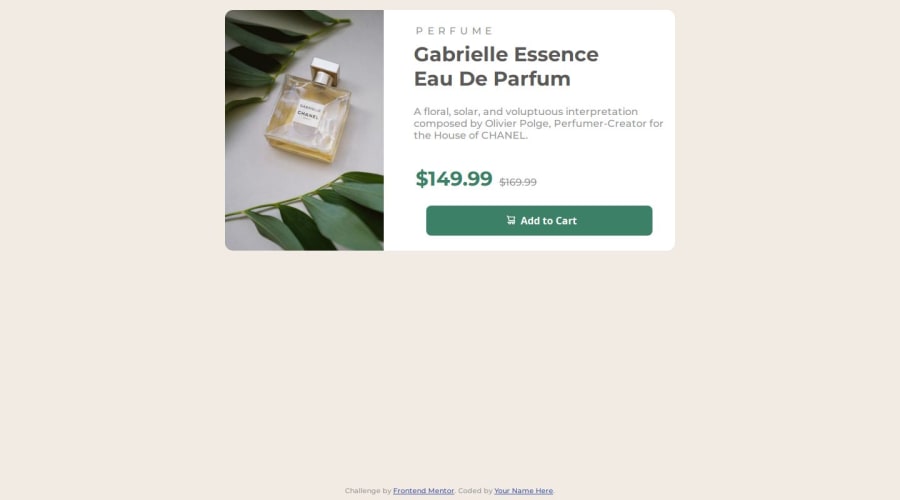
Flexbox, media queries, CSS variables, and Google Fonts


Design comparison

Solution retrospective
I'm most proud of achieving a clean, responsive design using Flexbox and media queries. Next time, I would refine the layout for even better cross-browser compatibility and improve accessibility features.
What challenges did you encounter, and how did you overcome them?I encountered challenges with ensuring the layout's responsiveness across different screen sizes and making elements adapt smoothly. I overcame these by thoroughly testing media queries and adjusting CSS properties to maintain consistency and functionality.
What specific areas of your project would you like help with?I’d like help with ensuring the responsive design elements function correctly across various devices and screen sizes, as well as optimizing the layout for different resolutions.
Community feedback
- @0xdvckPosted 8 months ago
- Semantic HTML: Evaluation: The project uses semantic HTML tags like <main>, <section>, and <img> with appropriate alt attributes. However, it could further benefit from using more semantic tags such as <article> for the product card. Improvements: Consider using <article> for the product card and <figure> for images with captions.
- Responsive Design: Evaluation: The layout adapts well to different screen sizes, maintaining a consistent design on mobile and desktop devices. Improvements: No major improvements needed, but ensure testing on various devices and browsers to confirm consistency.
- Code Structure and Readability: Evaluation: The code is generally well-structured, with clear class names and separation of concerns between HTML and CSS. Improvements: Consider organizing CSS into modular files if the project scales. Use BEM (Block Element Modifier) methodology for class naming for better maintainability.
- Design Consistency: Evaluation: The solution closely follows the provided design, ensuring a good visual match. Improvements: Ensure all font sizes, margins, and paddings match the design specifications. Use design tools like Figma or Sketch to measure exact values if necessary.
0

Please log in to post a comment
Log in with GitHub
Join our Discord community
Join thousands of Frontend Mentor community members taking the challenges, sharing resources, helping each other, and chatting about all things front-end!
Join our Discord