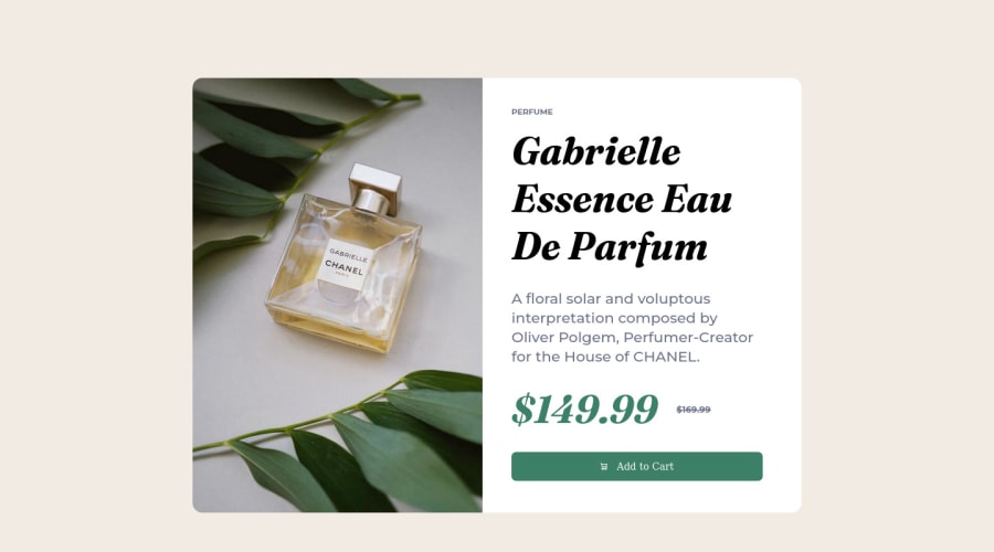
Design comparison
Solution retrospective
This project took me awhile before I could get it to this level of complete...
And I am 120% sure I got a lot of things wrong so, I WILL GLAD IF ANYONE COULD HELP MAKE ME BETTER......
Community feedback
- @AdrianoEscarabotePosted about 2 years ago
Hi Ayodele Hassan, how are you?
I really liked the result of your project, but I have some tips that I think you will enjoy:
- To improve the design of your project, there is a file that comes when you download the challenge images, always pay attention to the colors, it helps a lot to make it as equal as possible!
- try to reduce the font size a little in smaller resolutions, for the user to have a good experience!
The rest is great!
I hope it helps... 👍
Marked as helpful0 - @VCaramesPosted about 2 years ago
Hey @Xtrum, some suggestions to improve you code:
-
The Alt Tag Description for the image needs to be improved upon. You want to describe what the image is; they need to be readable. Assume you’re describing the image to someone.
-
Do not use inline CSS. It only clutters your code and makes it difficult to maintain your code.
-
The only heading in this challenge is the name of the perfume, “Gabrielle Essence Eau De Parfum”. The rest of the text should be wrapped in a Paragraph Element.'
-
The old price 🏷 is not being announced properly to screen readers. You want to wrap it in a Del Element and include a sr-only text explaining that this is the old price.
-
Your button has the incorrect hover color applied. You want to look at the “style-guide” to see what the correct color is.
Happy Coding! 👻🎃
Marked as helpful0 -
Please log in to post a comment
Log in with GitHubJoin our Discord community
Join thousands of Frontend Mentor community members taking the challenges, sharing resources, helping each other, and chatting about all things front-end!
Join our Discord
