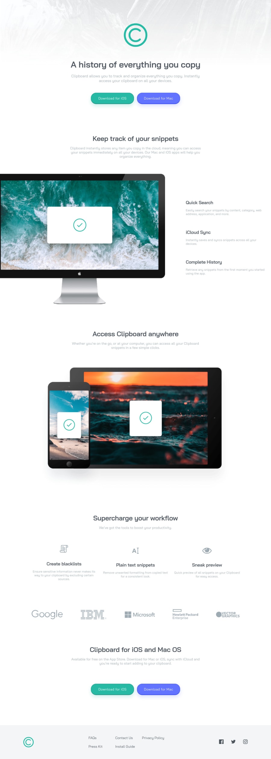
Flexbox Mania - Clipboard Landing Page Project

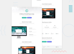
Design comparison

Solution retrospective
On the first run through I got the mobile version looking great (without figma because I didn't pay for Premium, yet), however I made the mistake of not taking the desktop version into account when I got the layout set up. The result quickly became a complicated mess with special classes and cases all over the CSS document.
I learned that sometimes (read: a lot of the time) flex-boxes are a great tool to utilize for responsive layouts and there's not necessarily anything wrong with nesting them to get things working correctly.
Any feedback is always appreciated! I'm working on improving my self-taught skills in front-end development to set myself up for a career in web development when I leave the US Army in about a years time. So any tips, hints, resources, etc. that you feel like throwing my way will be greatly appreciated. Cheers!
Community feedback
Please log in to post a comment
Log in with GitHub
Join our Discord community
Join thousands of Frontend Mentor community members taking the challenges, sharing resources, helping each other, and chatting about all things front-end!
Join our Discord