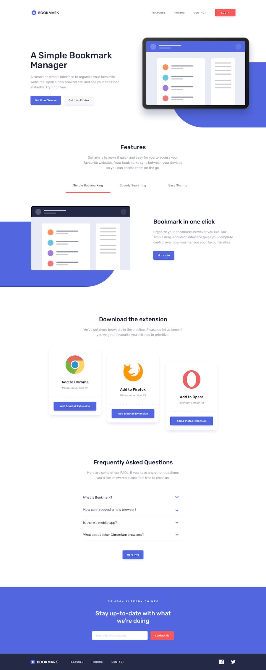
Flex-box made it unexpectedly awesome and it has simple javascripts!..
Design comparison
Solution retrospective
Hey, So I am a beginner in javascript, it was hard to write logics for this landing page but, with the help of tutorials I finally completed this challenge! It took almost 3-4 days to complete this and I am trying to increase my speed as much as possible.
I faced issues in:
- Home page background COLOR object
- Features Section Tabs links (Javascript logics*)
- Coding Accordian
- Last Section Subscribe Input* Validation JS
Some in these took more time, But I did it!
Community feedback
- @rks1995Posted about 3 years ago
Hi Atul! Congrats on finishing the project, the landing page looks good to me in both design and functionality wise.
I would highly suggest you to use correct html tag for the element, for ex: you used button element inside ul in the home section inside the nav section. i would recommend use 'li' as a button instead of using button element inside ul.
For better SEO use correct typography for headings, you cannot have h2 unless you have h1 beforehand.
Anyways well done on this project. Happy coding !!!.
0
Please log in to post a comment
Log in with GitHubJoin our Discord community
Join thousands of Frontend Mentor community members taking the challenges, sharing resources, helping each other, and chatting about all things front-end!
Join our Discord
