Design comparison
Community feedback
- @VCaramesPosted about 2 years ago
Hey @Xtrum, some suggestions to improve you code:
-
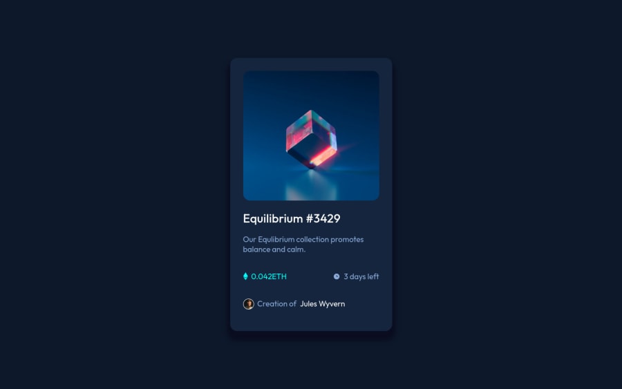
Your “NFT image” needs an Alt Tag. It should describe what the image is; it need to be readable. Assume you’re describing the image to someone.
-
The Icons serve no other purpose than to be decorative; They add no value. Their Alt Tag should left blank and have an aria-hidden=“true” to hides it from assistive technology.
-
You are currently using fixed properties. You want to use responsive properties to make your content responsive to different screen sizes.
Happy Coding! 👻🎃
Marked as helpful0@XtrumPosted about 2 years ago@vcarames pls, can you explain in details the term (fixed-responsive properties).....?
This is just my second week on css....
0@VCaramesPosted about 2 years ago@Xtrum
Fixed properties are properties that are static; they keep their shape at all times.
While responsive properties, are adaptable to the screen size.
While for this challenge, is won't make a big difference, it is something you want to get in the habit of doing. As it will make things easier once you get into the large projects.
Here is Google Developers link on responsive designs:
Marked as helpful0@XtrumPosted about 2 years ago@vcarames really appreciate the help... thanks a bunch.. !
0 -
Please log in to post a comment
Log in with GitHubJoin our Discord community
Join thousands of Frontend Mentor community members taking the challenges, sharing resources, helping each other, and chatting about all things front-end!
Join our Discord
