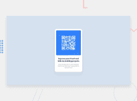
Design comparison
Solution retrospective
I had difficulties centering the card horizontally and especially vertically! Not sure about the flexbox stuff, it was my first contact with this subject.
Is it possible to center vertically without using flexbox?
Community feedback
- @md5daltonPosted about 2 years ago
Hello Thullyo Damasceno 👋
Your implementation of flex box to center the content vertically and horizontally if fine. However, let me suggest you use
min-heightinstead ofheightbecause the former means that the element's height should be at least that high but may increase if the content needs more room. Here's how I'd modify the styling on the body element:body { .... /* height: 98vh; */ min-height: 100vh; margin: 0; }There are several approaches that we can use to achieve this but we'll go through only 2 more below:
- Grid
- Position
Grid is also an excellent way to go. It makes use the
place-contentproperty which combinesalign-contentandplace-contentto center content perfectly in the middle of the page.body { min-height: 100vh; display: grid; place-content: center; }Last and least would be the use of
positionandtranslateproperties but I recommend you stick with flex box instead:body { position: absolute; top: 50%; left: 50%; translate: -50% -50%; }I hope that gives you and idea on which you can choose on your next projects. 👌
Marked as helpful3@vanzasetiaPosted about 2 years ago@md5dalton
The absolute positioning should not be on the
bodyelement. It should be on the card element. 🙂1@thullyoufrnPosted about 2 years agoHello, @md5dalton! 👋
Thanks for the feedback 🙂 I'll keep an eye on it next time!
0@thullyoufrnPosted about 2 years ago@vanzasetia
The
bodyelement should have aposition: relativeand the card element should have aposition: absolute, right?1@vanzasetiaPosted about 2 years ago@thullyoufrn
Yes, as long as the card is the direct child of the
bodyelement. But, I suggest using flexbox or grid instead of absolute positioning. 🙂1 - @correlucasPosted about 2 years ago
👾Hi Thullyo, congratulations on your solution!👋 Welcome to the Frontend Mentor Coding Community!
Great solution and a great start! From what I saw you’re on the right track. I’ve few suggestions for you that you can consider adding to your code:
1.Replace the
<p>containing the main title with<h1>note that this title is the main heading for this page and every page needs one h1 to show which is the most important heading. Use the sequence h1 h2 h3 h4 h5 to show the hierarchy of your titles in the level of importance, never jump a level.2.Add the
alt textto improve accessibility.The alt attribute provides alternative information for an image if a user for some reason cannot view it (because of a slow connection, an error in the src attribute, or if the user uses a screen reader). ---><img src="./images/image-qr-code.png" alt="QR Code Frontend Mentor">3.Use relative units like
rem or eminstead ofpxto have a better performance when your page content resizes on different screens and devices.REMandEMdoes not just apply to font size, but all sizes as well. To save your time you can code your whole page usingpxand then in the end use a VsCode plugin calledpx to remto do the automatic conversion or use this website https://pixelsconverter.com/px-to-remHere's my solution for this challenge if you wants to see how I build it: https://www.frontendmentor.io/solutions/qr-code-component-vanilla-cs-js-darklight-mode-nS2aOYYsJR
✌️ I hope this helps you and happy coding!
Marked as helpful2@thullyoufrnPosted about 2 years agoHello, @correlucas! 👋
Thanks for your feedback! I'll study more about the relative units to understand them better.
Hey, I have a question for you. I'm new here, so I don't know if I should change my solution, repost it, or maintain the solution as it is and utilize the new learnings got here in the comments just in the next projects. What should I do?
1@correlucasPosted about 2 years ago@thullyoufrn Its better you just update your solution, all you need to do is to do another commit and the live site will update automatically. If you repost the solution you'll lose the comments and the
mentor points.1@correlucasPosted about 2 years ago@thullyoufrn So quando fui te seguir que vi que vc era BR, foi mal hahahah
1@thullyoufrnPosted about 2 years ago@correlucas hahaha relaxa, é bom pra evoluir o inglês! Valeu pelas dicas cara, vou corrigir os erros e fazer o commit.
0 - @vanzasetiaPosted about 2 years ago
Hello, Thullyo! 👋
Congratulations on completing your first Frontend Mentor challenge! 🎉
There are multiple ways to center an element in the middle of the page. I recommend reading the "The Complete Guide to Centering in CSS | Modern CSS Solutions". Right there, you can find different ways to center a
div.I have some feedback on this solution.
imgelement must havealtattribute. The QR code is an important content of the page. So, it needs an alternative text.- For the
container-title, swap theptag withh1. Each page needs oneh1. - I recommend adding
rel="noopener"to any anchor tags that havetarget="_blank". It helps protect users of legacy browsers. I suggest reading the web.dev article to learn more about this.
That's it! I hope this helps!
Marked as helpful1@thullyoufrnPosted about 2 years agoHello, @vanzasetia! 👋
Thanks for the feedback! I'll read that article to learn more!
1
Please log in to post a comment
Log in with GitHubJoin our Discord community
Join thousands of Frontend Mentor community members taking the challenges, sharing resources, helping each other, and chatting about all things front-end!
Join our Discord

