Design comparison
Solution retrospective
I've been await from html, css and javascript for a while so basic stuff like importing the fonts took me some time to remember, also i forgot the best practices for the selectors and i feel like there was a better way to solve this.
Community feedback
- @0xabdulPosted over 1 year ago
Hi
Luis Gustavo
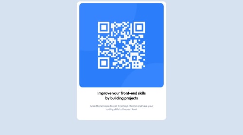
well congratulation completing on qr code component ✨I noticed that the qr code component is currently not center-aligned. Center-aligning this component could provide a more balanced and visually pleasing layout, making it easier for users to focus on the content without any distractions.
which can greatly improve the overall look and feel of the interface. Users are naturally drawn to centered content, as it helps maintain a consistent visual hierarchy and enhances readability. i give solution for center aligning the component
Solution ✅
In Css 🎨 :
body{ display:flex; align-items:center; justify-content:center; min-height:100vh; }
I Hope its usefull for you ! ✨
Marked as helpful1
Please log in to post a comment
Log in with GitHubJoin our Discord community
Join thousands of Frontend Mentor community members taking the challenges, sharing resources, helping each other, and chatting about all things front-end!
Join our Discord