Design comparison
Solution retrospective
Salut designers!
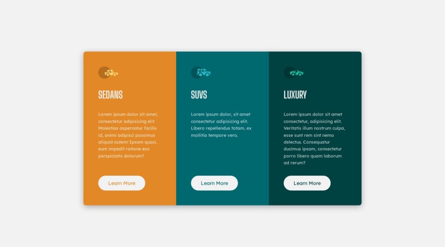
I have changed filled text to apply the scheme where the cards in desktop mode will still look decent if amount of text is different.
What I actually did in positioned all items inside each card as flexbox-column, and align it to bottom ( which became left ). It allowed me for .card__button {margin-top: auto;}
Considering the cards in desktop mode have .cards{min-height: 30rem;} the button will drop down the card ("eating" all available space with margin-top:auto, and the space between paragraph and button is now flexible. If text is so big and 30rem is not enough it will just stretch all .cards as much as needed.
If you have suggestions about layout please let me know!
Community feedback
- @0xabdulkhaliqPosted over 1 year ago
Hello there 👋. Congratulations on successfully completing the challenge! 🎉
- I have other recommendations regarding your code that I believe will be of great interest to you.
HEADINGS ⚠️:
- This solution lacks usage of
<h1>so it can cause severe accessibility errors due to lack of level-one headings<h1>
- Every site must want only one
h1element identifying and describing the main content of the page.
- An
h1heading provides an important navigation point for users of assistive technologies, allowing them to easily find the main content of the page.
- So we want to add a level-one heading to improve accessibility by reading aloud the heading by screen readers, you can achieve this by adding a
sr-onlyclass to hide it from visual users (it will be useful for visually impaired users)
- Example:
<h1 class="sr-only">3-column preview card component</h1>
- If you have any questions or need further clarification, you can always check out
my submissionfor this challenge where i used this technique and feel free to reach out to me.
.
I hope you find this helpful 😄 Above all, the solution you submitted is great !
Happy coding!
0
Please log in to post a comment
Log in with GitHubJoin our Discord community
Join thousands of Frontend Mentor community members taking the challenges, sharing resources, helping each other, and chatting about all things front-end!
Join our Discord
