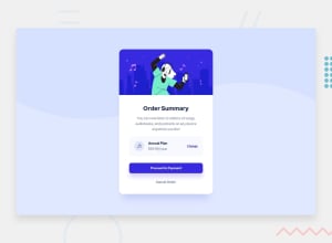
Design comparison
Solution retrospective
Please i need a feedback about the design, and also an easier way for code optimization. Thank you
Community feedback
- @ZenCode95Posted about 3 years ago
Hello sir, I think you've done pretty well with this challenge so far, but there are some things that I'd like to suggest:
Spacing - by studying the template design for this challenge, you can see that pretty much everything within the order summary card has a certain amount of spacing around it (whether that be with margins or padding) and if you want to get your project to look as close to the original as possible, paying attention to spacing will be a big part of that. For example, there is more space than is required around the div that contains both the h2 element with the text of "Order Summary" and the paragraph element below it, so you might want to try reducing the padding around both of these. That's what I would say about spacing. Remember that you don't have to get it perfect, you only have to try and get it as close as you can with your level of ability.
Centering - So, for the h2 and paragraph element you've done the right thing by using 'text-align: center;' but for the next div it seems that two of the three nested divs called "sub" and "link" aren't centered. Now, admittedly I had some trouble figuring this out myself, but got there in the end. I would recommend thinking about the various ways you can use both CSS Grid and Flexbox, and remember that you can use flexbox within a grid container! It's very useful for centering divs. Also keep in mind that you can set flexbox items as flex containers themselves so that the content inside those child items affect their their own child items in turn.
Fonts and styling - using the right styling will go a long way in making your project look as close to the challenge template as possible, so remember to pay close attention to the documentation for the design, which is found in the 'style-guide.md' when you download the starter files. The thing that I learned while working through this challenge is that there are details about this design that aren't immediately obvious to you and there's no hand-holding! For example, in the template design the text of "Order Summary" isn't colored black but is actually using a particular color that is provided in the style guide. You'll just have to look at the template and see for yourself what colors are being used when and where, which is good because it teaches you to think and work through things inquisitively and scientifically.
For optimising your code: you want to go through your HTML and CSS and check for any mistakes like having two of the same thing and also poor structuring. As an example, after taking a look at your css file I noticed that you have two element selectors for both h2 and p tags. The better thing to do here is to simply include all styles for h2 elements in just one css element selector. Generally speaking, it's a good idea to always try and find ways of shrinking the amount of markup/code we initially write so that things run smoothly and efficiently. Think of the saying "less is more"; that's essentially the goal.
Best of luck!
0@Eugene44-hubPosted about 3 years ago@ZenCode95 thank you very much I really appreciate your feedback, I will improve my skills from the above mentioned. Thanks
1 - Account deleted
Hi,
It looks ok, but the background color I think isn't the correct one particularly the one at the bottom, and the section with the price I don't think it is styled, or you might have missed some things.
Keep coding👍.
0@Eugene44-hubPosted about 3 years ago@thulanigamtee Thanks very much I really appreciate you guys for the feedback
0
Please log in to post a comment
Log in with GitHubJoin our Discord community
Join thousands of Frontend Mentor community members taking the challenges, sharing resources, helping each other, and chatting about all things front-end!
Join our Discord
