Design comparison
SolutionDesign
Solution retrospective
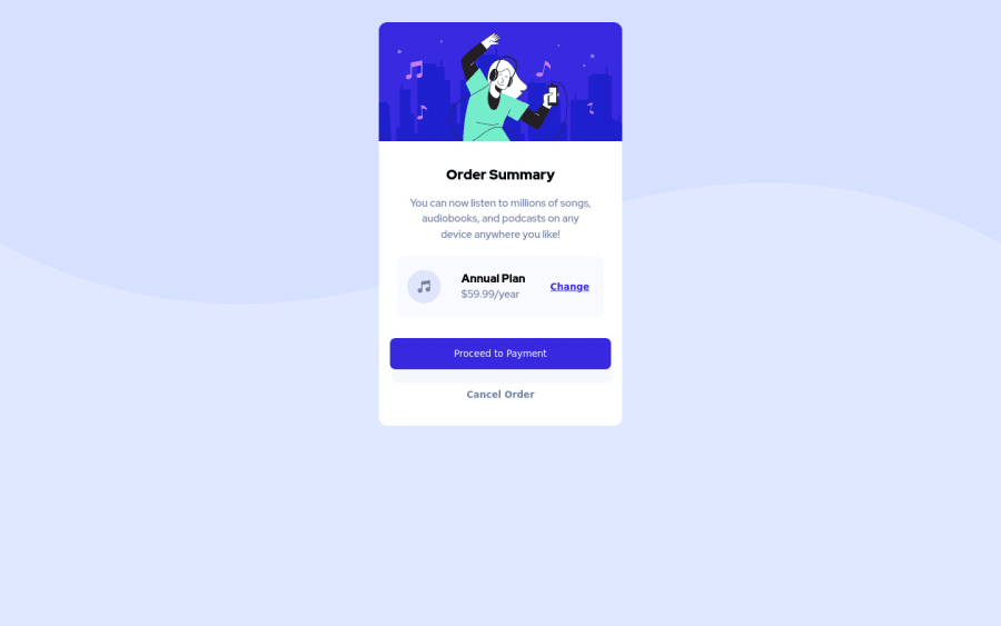
This is my second completed Front-End Mentor project. I will say this one was a-lot easier than the first one.
Community feedback
- @grace-snowPosted over 1 year ago
Hi
This looks a little broken on my mobile with text overlapping the music icon. I’m not sure why that text has a negative left margin?
Other feedback:
- you need to learn how and when to write alt descriptions on img tags. Read up on that
- I’m not sure why proceed and cancel are button elements. What would you expect to happen on click of those? Would they not navigate?
- proceed and cancel do not need wrapping in divs
- never ever have font size in px. It’s very important to use a responsive unit like rem so that users can resize the text when they need to
- related to that, never ever limit the height of cards like this (never limit the height of any element containing text). Let the browser decide how tall the component needs to be , there is no reason to set a height
- I don’t know why you’ve given the page background image a negative position. That seems unnecessary and definitely unusual
- the body needs min-height 100Vh to vertically center content
- do not set an explicit width on the card. Instead, use max-width so it can shrink if it needs to
- for shorter css you can set border radius on the card itself and use overflow hidden so the corners of the image inside also get cropped
- have a div to wrap all the text content of the card and set padding on that. Then the plan box can be 100% wide
- setting max width in % on elements like paragraphs is highly unusual. In a larger project that kind of css would become impossible to maintain
- let the proceed element be full width. Only ever keep paddings small. This is a good use case for em for that padding
- make sure there is a little margin around card so it can’t touch screen edges (or padding on the body in this challenge)
0@sparechange169Posted over 1 year ago@grace-snow Thanks for the feedback grace...looks like I'm going to have to go back to the drawing board and work on this one a little bit more
0
Please log in to post a comment
Log in with GitHubJoin our Discord community
Join thousands of Frontend Mentor community members taking the challenges, sharing resources, helping each other, and chatting about all things front-end!
Join our Discord