Design comparison
Solution retrospective
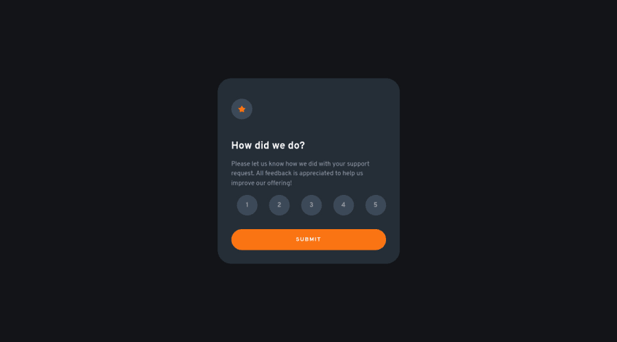
I couldn't get the list of choices to align with the left edge of the card using flexbox and justify-content: 'space-around'. flexbox and justify-content: "flex-start" with a hard coded margin-right also didn't look quite right, so I went with the former.
The background colour for the rating choices didn't seem to match any of the colours in the style guide so I extrapolated using the second darkest blue, the card's colour.
Community feedback
- @correlucasPosted about 2 years ago
👾Hello @rhyuen, Congratulations on completing this challenge!
Great code and great solution! I’ve few suggestions for you that you can consider adding to your code:
To improve the card overall responsibility, you can start to add
flex-wrapinside the class that manages the section for therating numbers buttonand makes the adjust to fit in different rows while the container scales down, not that without this property the container doesn't shrink. Here's the code applying these changes:.card__row { display: flex; justify-content: flex-start; margin: 1rem 0; flex-wrap: wrap; }✌️ I hope this helps you and happy coding!
Marked as helpful0 - @Alejandro25ARPosted about 2 years ago
Hi @rhyuen.
You can't align the list of options to the left, because the
inputsare still visible and taking up space, so thejustify-content:space-betweenalso affects them. To fix this you could place the hidden entries as follows:.card-row input { display:none; } // or you could input[type="radio"] { display:none; }That way they don't take up space and the list is already left-aligned.
Good job, keep up the good work!
Marked as helpful0
Please log in to post a comment
Log in with GitHubJoin our Discord community
Join thousands of Frontend Mentor community members taking the challenges, sharing resources, helping each other, and chatting about all things front-end!
Join our Discord
