

Design comparison

Solution retrospective
I'm proud of nothing, this project just showed how weak I am at programming right now.
What challenges did you encounter, and how did you overcome them?The most problematic challange was to center the elements, I tried to find the problem for a lot of time, then I just asked the problem to chatgpt, obviously I didn't use the chatgpt's solution, I only asked the problem.
What specific areas of your project would you like help with?Is there any simpler and faster way to center the elements other than the way I wrote? And I found it difficult ti adjust the width and height.
Community feedback
- P@shimtandyPosted 7 months ago
Hey David,
Good job. Don't stress about not understanding everything to begin with - just take everything you learn as a small win.
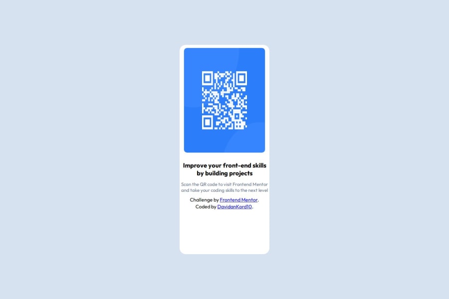
In regards to the trouble you're having with setting the size for elements, I'd suggest only setting a width for the image. By default, if you set a width, it should retain the same aspect ratio and so the height should be adjusted automatically so it remains a square. That would fix the main difference I noticed between your implementation and the design - the image is stretched currently.
The way you've centred the div is spot on I'd say. The standard way to do such a thing these days is to give the parent container a display of 'flex' and then use 'align item: center' and 'justify-content: center'. This will centre it to the parent container. If you want it centred in the middle of the screen, you need to be sure that the parent container is the size of the screen then. The parent container of the div is the body element and so you need to make this the size of the screen. By default I believe the body is always 100% width. The height is slightly trickier though because by default it will have a height large enough only to contain its child elements. A way to make it the full screen height (but also allow it to grow larger if needs be) is to set (min-height: 100vh). The vh unit stands for 'view height' and will always be equal to 1% of the screen height.
Hope that helped somewhat and wasn't overwhelming :)
Marked as helpful0@xNyfPtxPosted 7 months ago@thanderwism the body seems to be width: 100% since it is a block element, technically its width: auto
1 - @Jala30Posted 7 months ago
Hi,
Just suggesting some improvements - In the desgin, the image seems equal in height and width, while in your preview the height seems greater than width. Also the left the right padding for the image can be a little bit greater. Due to this lack of padding - your preview looks a little congested.
Also to your question, the method you used to center is a pretty standard ways. Using classnames for the elements would make it a bit more optimized.
0


Please log in to post a comment
Log in with GitHubJoin our Discord community
Join thousands of Frontend Mentor community members taking the challenges, sharing resources, helping each other, and chatting about all things front-end!
Join our Discord