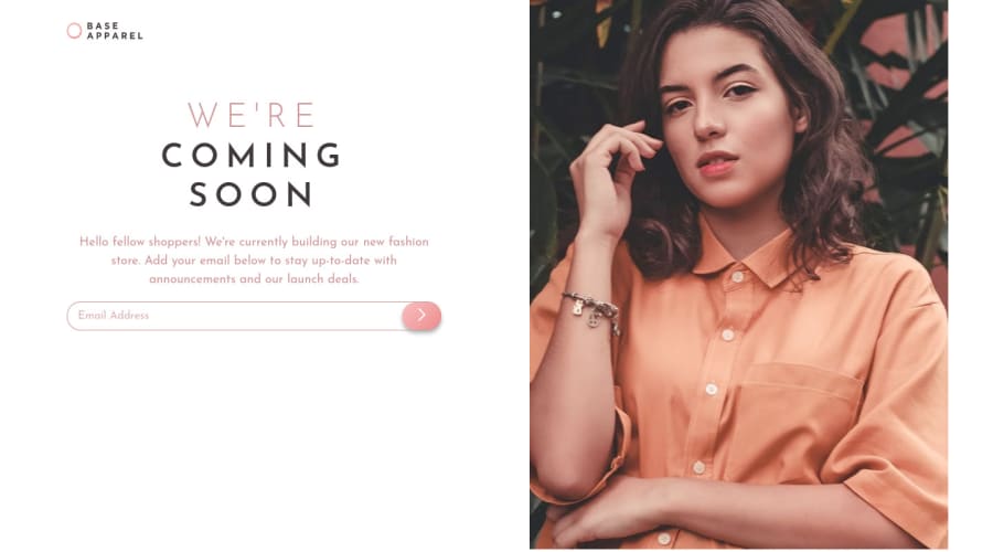
Flexbox / Grid + Simple input validation via Regex / vanilla JS
Design comparison
Solution retrospective
I'd love feedback as I am still learning (especially JavaScript)!
Community feedback
- @pikapikamartPosted about 3 years ago
Hey, awesome work on this one. Desktop layout looks fine, it is somehow responsive but the image is not taking full height when the screen-width changes. Mobile layout looks great though.
Kirin already gave feedback on this, just going to add some suggestions as well:
- It would be great to have a base styling with these properties
html { box-sizing: border-box; font-size: 100%; } *, *::before, *::after { box-sizing: inherit; }
This way, handling an element's size will be lot easier because of the
box-sizing: border-box
. You can search up some more of how this works.- On your
body
tag change thebackground-image: url(/images/bg-pattern-desktop.svg);
tobackground-image: url(./images/bg-pattern-desktop.svg);
using/
or root path in github does not work. - Always have a
main
element to wrap the main content of your page. On this one, the.wrapper
should be using themain
instead ofdiv
. - Website-logo
img
should be using the website's name as thealt
likealt="base apparel"
. Remember that a website's logo is meaningful so always make sure it uses the properalt
value. h1
should betext-align: left
and you don't need to use thosespan
inside it to make each text wrap onto another row, you should just usemax-width
on theh1
and let the text wraps.- Your
input
tag lacks an associatedlabel
tag on it. Since there are visible-label, thelabel
would be a screen-reader only label, meaning it would make user of likesr-only
class. The text-content should describe what theinput
needs like the value on theplaceholder
. - error-icon is not showing, check for
/
path usage. - Now, the form error works but only limited for sighted users. A great way to make the
input
more accessible should be done like this:
if ( input is wrong ) input.setAttribute("aria-invalid", "true"); input.setAttribute("aria-describedBy", id of the error-message); else input.removeAttribute("aria-invalid"); input.removeAttribute("aria-describedBy");
The error-message element should have an
id
attribute which is referenced by thearia-describedBy
attribute on theinput
element. By doing that, your user will know that theinput
is wrong because ofaria-invalid
and they will know what kind of error they made because of thearia-describedBy
- Another idea to implement to further improve accessibility is to have an
aria-live
element that will announce if theform
submission is a success or not. If you are confused on what said, have a look at this simple snippet that I made for accessible form you can always ask me if you have any questions about this one^^
Aside from those, great work again on this one.
1 - @Kirin02Posted about 3 years ago
Hey, i'd say try to make the submit button hover animation a bit more interesting i would say, the position of the image is kinda odd i'd say espcially since it got sharp edges i would say move it to the extreme right or limit the height or something if you use inspect tool you'll find that it overflowing from the <body> Also It highly unrecommended to Use !important other than that i like the mobile display it looks really good but i think you can improve the desktop one a bit more
0
Please log in to post a comment
Log in with GitHubJoin our Discord community
Join thousands of Frontend Mentor community members taking the challenges, sharing resources, helping each other, and chatting about all things front-end!
Join our Discord