Design comparison
SolutionDesign
Community feedback
- @Art-wdtPosted over 3 years ago
Hey! Great job! Keep coding! Improve your web developer skills
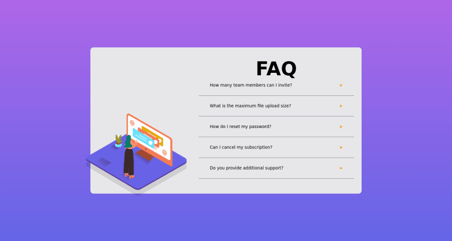
You can make background-color:white; for FAQ`s block.
Heading bolder when click that will be perfect.
Also, when every answer are opened, it is makes the design more boring. You could have either:
- Make the block height larger. to contain everything when too many menus are opened. or
- Open only one answer at a time. When opening the next one, close the previous one.
I also did this and used jQuery. I will be glad to your opinion. Please see my work.
Happy coding!
Marked as helpful0
Please log in to post a comment
Log in with GitHubJoin our Discord community
Join thousands of Frontend Mentor community members taking the challenges, sharing resources, helping each other, and chatting about all things front-end!
Join our Discord
