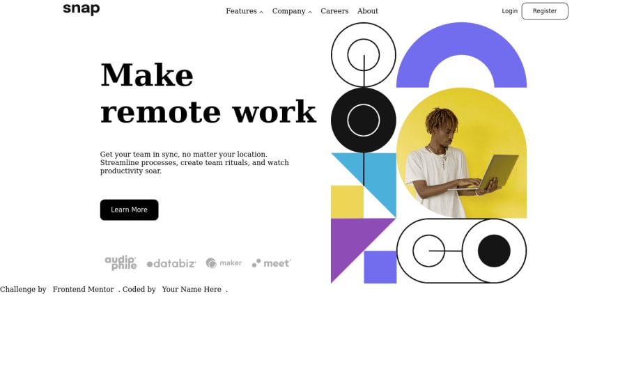
Design comparison
Solution retrospective
hello, world... I got through the hardest time of my life while I was working on the sidebar menu but I did it . for me sidebar was like nightmare but enough is enough . hope to see more perfect way to create nice design
Community feedback
- @ghintemaPosted over 2 years ago
Hi Hamid-Abdallah-Mohammed,
I've reviewed your code and I'd like to give you some comments that may be useful to improve yourself. First of all I am wondering, why you've build to different navigations in the html-structure. You have one for the desktop-version nested into <nav></nav> (wich is good, of course) and a second navigation nested into <div class="mobile-nav"></div>. This irritated me a lot! :) You really could (and should) have done mobil and desktop with the one nested in the <nav></nav>. Secondly I would advice you to always build your menu-structure in list-elements like this: <ul><li></li></ul>. You can even do that with two or more layers of menu-structure by nesting a <ul><li></li></ul> INSIDE A <li></li>. It really is more semantical and (much) easier to layout one single <nav></nav> for mobile and desktop. One last (miner) thing that rose my curiosity is this (from line148): grid-template-columns: repeat(1, max(200px, 350px)); What sense does it have to max(250px, 350px)? The max of 250 and 350 is always and forever 350px.
If you have further questions on my coment, don't hesitate to get back on me! I hope I could help you a bit. Really mean to do that... Cheers, Harm
Marked as helpful1 - @umar453Posted over 2 years ago
Nice overall. for good user experience try to add cursor pointer on dropdown links and at the moment user click on the dropdown link the icon would be changed downward.
Marked as helpful0
Please log in to post a comment
Log in with GitHubJoin our Discord community
Join thousands of Frontend Mentor community members taking the challenges, sharing resources, helping each other, and chatting about all things front-end!
Join our Discord
