Design comparison
Community feedback
- @correlucasPosted over 2 years ago
👾Hello Otebele, congratulations for your solution!
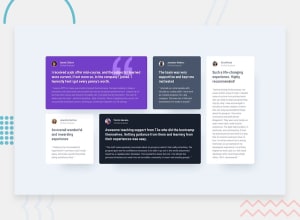
You've done pretty much anything here, this is hard challenge but you've set correctly the grid layout, this is amazing. There's only some little details you can fix about semantics and design:
Here's my tips for your:
1.Give more padding around for each card in order to create a bigger gap between the content and the card borders, use a value around
20pxfor the general padding.2.Not that there's a little little detail you'll forgot, the purple and the black profile photos have a circle around its image, to do the that add
border: 4px solid purple;.3.Wrap the content with semantic tags, for example the cards you can use or
<section>or<article>instead of div, thats just a block element without meaning, and for the quote texts you can use<blockquote>instead of just using<p>. Its much better like this because this tags describes exactly which content they've inside.The rest is really good and is only a matter to fix these small details bro.
Keep it up and happy coding!
0
Please log in to post a comment
Log in with GitHubJoin our Discord community
Join thousands of Frontend Mentor community members taking the challenges, sharing resources, helping each other, and chatting about all things front-end!
Join our Discord
