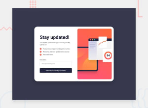
Design comparison
Community feedback
- P@AntonvasilachePosted 10 months ago
Hello,
Nice work in creating the layout. You could improve this by using the font that was mentioned in the style guide. Something like this should do the trick, in the html head tag:
<link rel="preconnect" href="https://fonts.googleapis.com" />
<link rel="preconnect" href="https://fonts.gstatic.com" crossorigin />
<link href="https://fonts.googleapis.com/css2 family=Roboto:wght@400;700&display=swap" rel="stylesheet"/>
And then in the css file:
* {
  font-family: "Roboto", sans-serif;
}
Hope you find this useful. Good luck!
1@Anni-123-arcPosted 10 months ago@Antonvasilache thank you❤️ for your valuable suggestion. I tried my best to make it look as accurate as possible.I was really struggling while making it reaponsive😵💫 please can you give me any suggestions on how to make it responsive ,it will be a great help.
0
Please log in to post a comment
Log in with GitHubJoin our Discord community
Join thousands of Frontend Mentor community members taking the challenges, sharing resources, helping each other, and chatting about all things front-end!
Join our Discord
