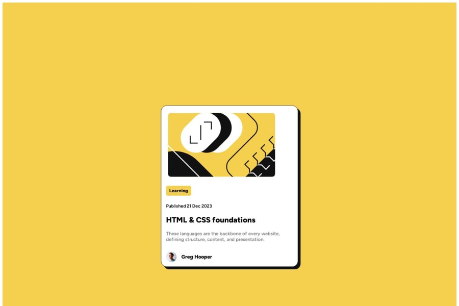
Design comparison
Solution retrospective
One problem faced - aligning div in center of its parent div
Community feedback
- @beowulf1958Posted 11 months ago
Congratulations on completing the challenge!
Just to add to the comment from @ratul0407:
Using his suggestions, the card centers nicely, but the card content is not neatly framed. This is because of the child width of 28%. Here it is better to use rem:
.child{
    width: 22rem;
    height: auto;
    background-color: hsl(0, 0%, 100%);
    border: 1px solid hsl(0, 0%, 7%);
    border-radius: 18px;
    display: flex;
    flex-direction: column;
    justify-content:center;
    align-items:flex-start;
    padding-top: 15px;
    padding-left: 15px;
    padding-right: 15px;
    /*margin-bottom: 10px;*/
    box-shadow: 8px 8px hsl(0, 0%, 7%);

}
now the content is more or less centered in the card.
You should also add a hover effect on your heading:
#subchild2_heading:hover {
color: hsl(47, 88%, 63%);
}
Hope this helps!
0 - @ratul0407Posted 11 months ago
@Shivayshiva congrats on completing this challenge🎉🎉
To center the card just do this,
body {
    min-height: 100vh;
    margin: 0;
    display: grid;
}
.main {
    /* max-width: 1440px; */
    /* height: 120vh; */
    background-color: hsl(47, 88%, 63%);
    display: flex;
    flex-direction: column;
    justify-content: center;
    align-items: center;
}
There is a default margin of 8px around the body that is causing the white spaces all around the corners. That's why you need to set
margin: 0. And to make the solution properly work you need to comment out the height and width property from yourmain.I hope you found this helpful👍👍
Have a nice day and happy coding🙂
0
Please log in to post a comment
Log in with GitHubJoin our Discord community
Join thousands of Frontend Mentor community members taking the challenges, sharing resources, helping each other, and chatting about all things front-end!
Join our Discord
