Design comparison
Solution retrospective
I feel like my HTML is an accessibility nightmare. Would love some tips on making it more accessible.
Community feedback
- @JackNotroPosted almost 2 years ago
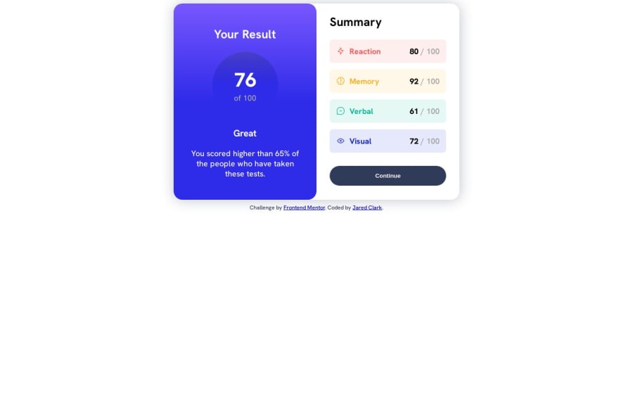
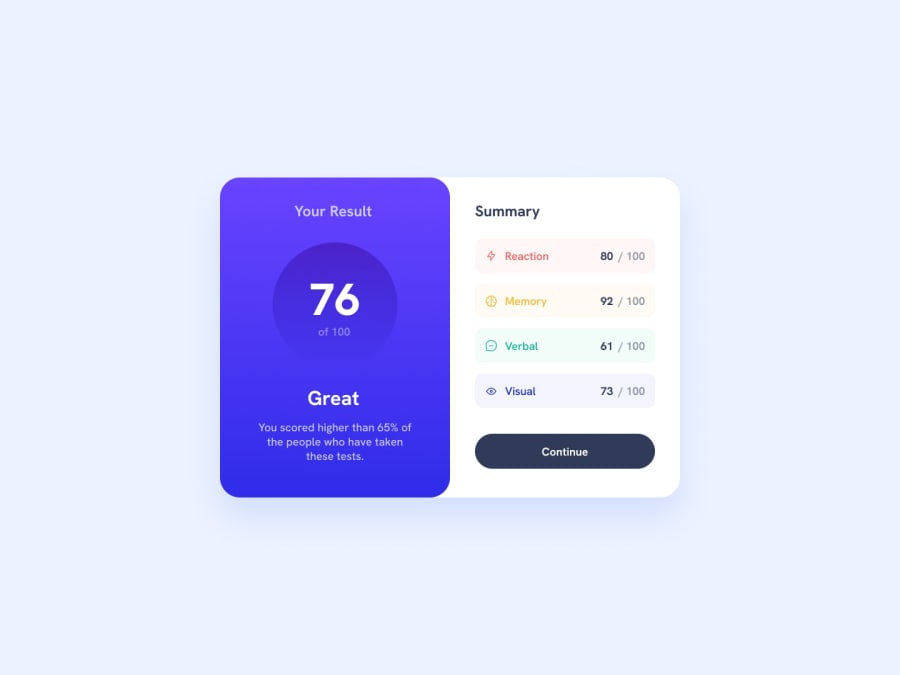
The only problem you have is with centering the summary card element... you should have applied flex on the body and centered the items... and add a container for the summary card element and add the credits there. css fixing:
body{display:flex; align-items: center; justify-content:center;}html fixing:<div class="outer-container"><div class="summary-card-container"></div> *credits here</div>0
Please log in to post a comment
Log in with GitHubJoin our Discord community
Join thousands of Frontend Mentor community members taking the challenges, sharing resources, helping each other, and chatting about all things front-end!
Join our Discord
