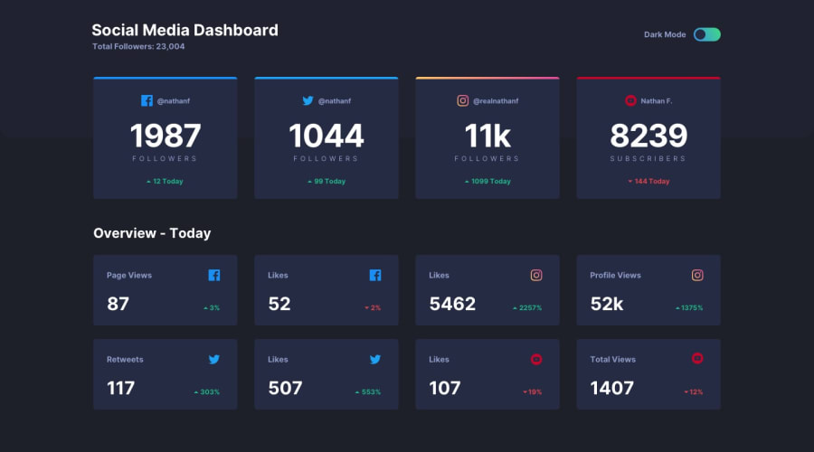
Design comparison
SolutionDesign
Community feedback
- @MikevPeerenPosted almost 3 years ago
Hey 👋
Try not to add alt text to meaningless icons like the Facebook icon, a screenreader has no use for that.
Also try to diversify your html elements, for example using headers and using lists for the different data.
Other than that good job 👏
Marked as helpful0
Please log in to post a comment
Log in with GitHubJoin our Discord community
Join thousands of Frontend Mentor community members taking the challenges, sharing resources, helping each other, and chatting about all things front-end!
Join our Discord
