Design comparison
Solution retrospective
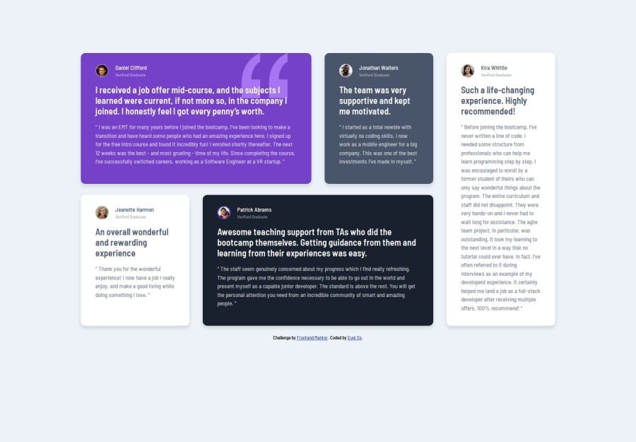
Hello. I tried to make the page through mobile-first. I'm not very good at responsive layout yet. I made styles for 375px and 1400px only, no smooth transition. I look forward to any comments and criticism. Thanks
Community feedback
- @GerriEzeochaPosted about 3 years ago
Your desktop layout looks good, but review your responsive designs and display for mobile. As for your question the main difference I believe is that <section> is more generic tag, while <article> is more specific. check out usage notes on when to use either on https://developer.mozilla.org/en-US/docs/Web/HTML/Element/section
Marked as helpful0 - @AgataLiberskaPosted about 3 years ago
Hi Evgi! Nice work on this challenge, but the layout switching to grid right past 375px is not great - a very easy fix would be to edit your media query from min-width: 376px to something like 1024px, and then add a max-width when the reviews are in a column, just so they don't stretch out too much :)
Other than that, I think your solution is really nice, well done :) and as for your question about section and article, I'm a bit unsure about them too since you can have articles within a section and sections within an article - but I think you made the right choice here!
Marked as helpful0 - @EugiSsPosted about 3 years ago
Also i don't understand very well when it is better to use tags <section> and <article>. And the difference between them. If anyone can explain i will be glad.
0
Please log in to post a comment
Log in with GitHubJoin our Discord community
Join thousands of Frontend Mentor community members taking the challenges, sharing resources, helping each other, and chatting about all things front-end!
Join our Discord

