Design comparison
SolutionDesign
Solution retrospective
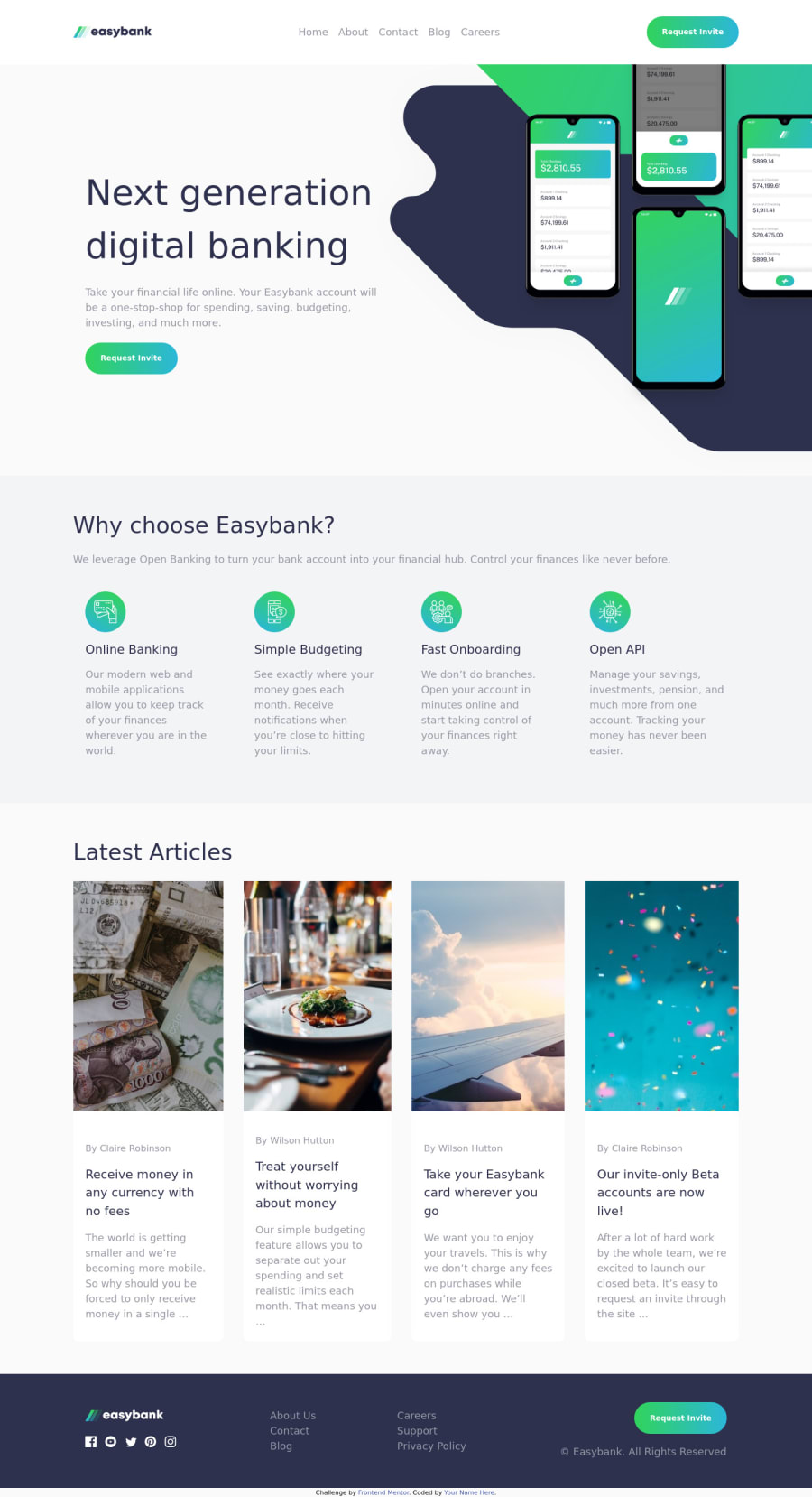
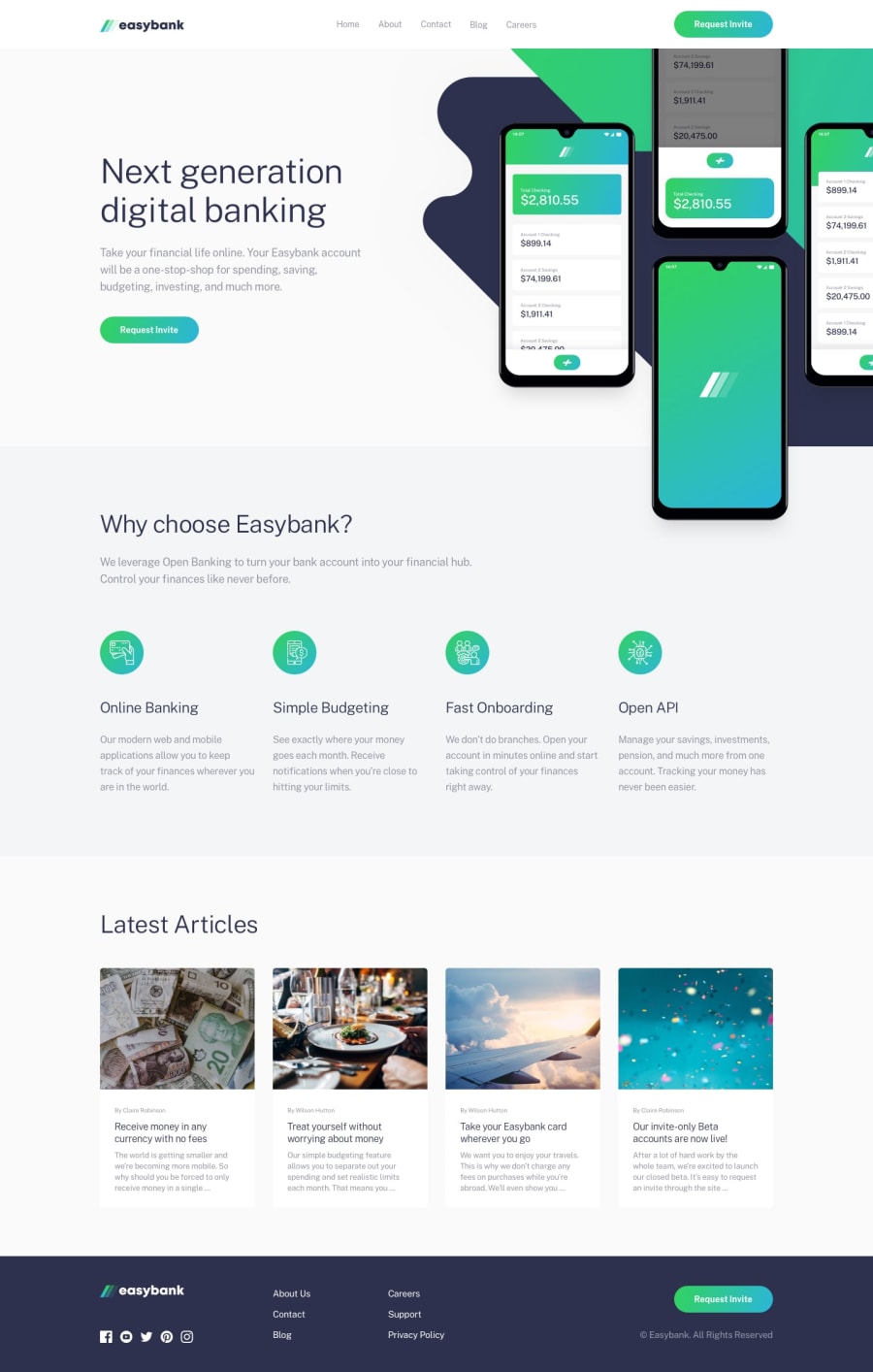
Hello Frontendmentor community, I finally completed this challenge and would appreciate any feedback on how to improve my code. The layout looks okay on the screen sizes specified in the challenge but I noticed they didn't look good on some screens like Nest Hub and ipad mini. The JavaScript code is also working well, however I'm concerned with the performance, I used the resize event to monitor the screen size of the device and it works but I read that this method impacts the performance. Any tips at all and especially concerning these two points is much appreciated. Thank you :)
Community feedback
Please log in to post a comment
Log in with GitHubJoin our Discord community
Join thousands of Frontend Mentor community members taking the challenges, sharing resources, helping each other, and chatting about all things front-end!
Join our Discord
