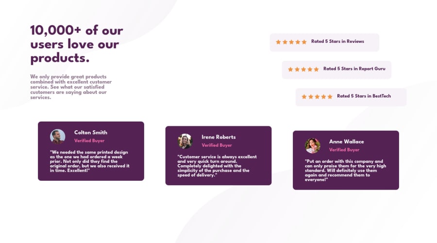
Design comparison
Solution retrospective
Any suggestion on code optimization is welcome :)
Community feedback
- @correlucasPosted about 2 years ago
👾Hello @py-rod, Congratulations on completing this challenge!
I've just opened your live site and I can say that you did a great job putting everything together! There's some tips to improve your solution:
1.You need to include the title for you PAGE. Do that inserting in the <head> the tag <title> →
<title>Social Proof - Front End Mentor</title>2.You did a really good work here putting everything together, something you can improve its your code html markup and semantics. You can replace the
<div>that wraps each card with<article>you can wrap the paragraph with the quote with the tag<blockquote>this way you'll wrap each block of element with the best tag in this situation. Pay attention that<div>is only a block element without meaning.✌️ I hope this helps you and happy coding!
Marked as helpful1 - @hyrongennikePosted about 2 years ago
Hi @py-rod,
Nice job on the challenge
You can position the content in the middle of the page by using the following.
section.card {
    display: flex;
    flex-direction: column;
    justify-content: center;
}

.card__container__text__value {
    padding: 0;
}
Also check the report above there are some HTML issues. Hope this is helpful.
1
Please log in to post a comment
Log in with GitHubJoin our Discord community
Join thousands of Frontend Mentor community members taking the challenges, sharing resources, helping each other, and chatting about all things front-end!
Join our Discord
