

Design comparison

Solution retrospective
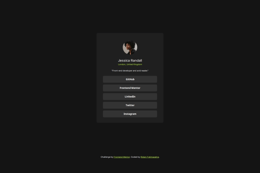
the final result.
What challenges did you encounter, and how did you overcome them?the default margin of <p> element, and finaly i remove it in order to do it manually.
What specific areas of your project would you like help with?nothing !
Community feedback
- @Til-daPosted 1 day ago
Your code is well-structured and responsive, ensuring the layout adapts to different screen sizes. However, The font weight for the name (.name) is set to 150, which may be too light—using 600 or 700 would improve visibility. Additionally, adding cursor: pointer; to the .btn class ensures a better user experience, especially on mobile devices. The footer might overlap content on smaller screens, so positioning it at the bottom with position: absolute; bottom: 10px; width: 100% could keep it in place.
0

Please log in to post a comment
Log in with GitHubJoin our Discord community
Join thousands of Frontend Mentor community members taking the challenges, sharing resources, helping each other, and chatting about all things front-end!
Join our Discord