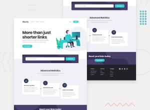
flexbox, clamp(), max-width on images, flex-grow, flex-basis
Design comparison
Solution retrospective
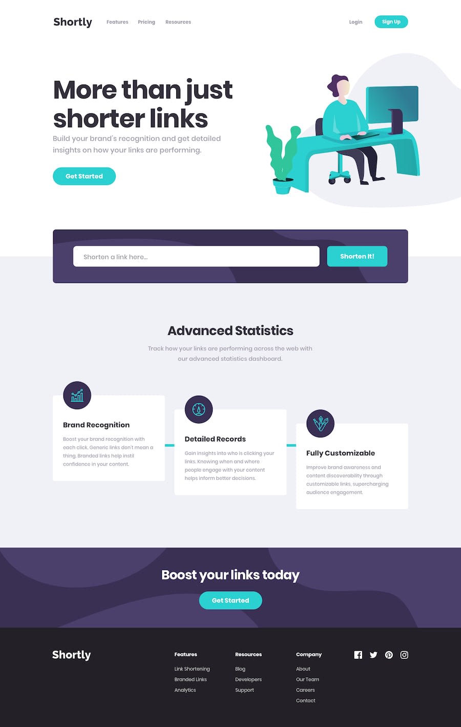
It took a hard times to figure how to position the 3 cards down there, I came up with the conclusion of making the cards container a flexbox and it a height, then used the align-self on the second card to bring it into center and the third to the end, which brought the desired results, Although I'm not sure on how to add the loading animation and the cyan color lines are pretty hard to add,
If any one is familiar on how to make a loading animation and integrate it please feel free to comment, when i click the button to generate the link, I have to wait a few seconds, so it would be better if there was an animation for that. While you are at it please do recommend how can I make this page more interactive through Javascript
If you find any piece of code unreliable please tell me I'm really unsure of the copy button, when I bring it in the parent container the ui problem gets fixed and it does not look ugly anymore but then the clicking the copy button does nothing, I'm really unsure of the foreach loop, I mostly did the Js part through Trial and error and I really feel bad about it
Community feedback
Please log in to post a comment
Log in with GitHubJoin our Discord community
Join thousands of Frontend Mentor community members taking the challenges, sharing resources, helping each other, and chatting about all things front-end!
Join our Discord
