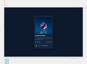
Design comparison
Solution retrospective
Tell me what you think it is weird in the design. All feedback is welcome .
Community feedback
- @elaineleungPosted over 2 years ago
Hi Yoseif, welcome to Frontend Mentor, and congrats on completing your first challenge! I think this is a good start where you learn how HTML and CSS works by seeing how to customize your own design. I would still encourage you to try to work on this challenge again to try to recreate the original design, especially if you're looking to get into front-end web development, as it's very important to be able to make your work looking like the design as much as possible.
Also, I was looking through your report and saw that you got a typo in
<html lang=`eg`>. I think it should beenif you mean to indicate "English", and also you should use regular quotation marks instead of backticks (as in"en"and not`eg`).Good luck, and keep coding :)
Marked as helpful1 - @correlucasPosted over 2 years ago
Hell Yoseif, I liked what you did in this solution, is abstract, I saw that the main concepts of the challenge we're applied. The only thing I would change for design matters is the font, using a sans-serif font. But I really liked that you tried to apply something else to the solution and not only what was required.
Sometimes I do it too, like a did I this challenge: https://www.frontendmentor.io/solutions/freshprince-profile-card-component-custom-design-and-hover-states-NKHxJ_Asug I've changed all the design like you did!
To improve you code by the semantic perspective you can fix the accessibility issues checking your solution page report.
- You need to indicate the language of your page in html with <html lang="eg">
- Add a
<main>tag to wrap the card instead of using a div
Hope it help you!
Marked as helpful0
Please log in to post a comment
Log in with GitHubJoin our Discord community
Join thousands of Frontend Mentor community members taking the challenges, sharing resources, helping each other, and chatting about all things front-end!
Join our Discord
