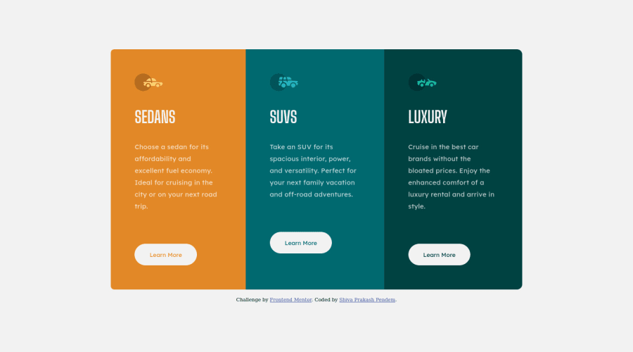
Design comparison
Solution retrospective
Practising the basics. Feel free to comment your thoughts on the code or the design.
Community feedback
- @correlucasPosted over 2 years ago
👾Hello Shiva, congratulations for your solution!
I've inspected your code and everything is good, you component is really flexible and responsive. I liked a lots that you've used a single
classto manage all the cards together, isn't everyone that pay attention to that. I think you can do only some work around the code cleaning it and improving the semantics.Here's my tips:
Remove the <section> wrapping all the cards and use the <main> to wrap all cards (in the end you remove one block level and the result is the same) and for each card you can replace the divs with <section>. Note that div is just a block element without semantic meaning, so for important blocks you should ever use tags like section, article, picture, figure and etc.
Hope it helps and happy coding!
Marked as helpful1@shivaprakash-sudoPosted over 2 years agoHello Lucas, thank you.
I understand, I'll improve them.
I actually wanted to do that way at first, but since the cards are all attached, I thought to myself that having one section would be better. Maybe I'll have cards as articles and then wrap all of them inside a section, how does that sound?🤔
1@correlucasPosted over 2 years ago@shivaprakash-sudo Articles seems a good idea too. My advice was more about cleaning the code, but note that your solution is already working was only a little little detail if was a big landing page could be more problematic but in this case you can let the way it is.
0@shivaprakash-sudoPosted over 2 years ago@correlucas
I understand. If you don't mind me asking, what parts of the code can be optimized?
0@correlucasPosted over 2 years ago@shivaprakash-sudo You can transfer the class
cards-containerto the <main> and delete the section holding the cards for example, the main will hold all the card elements, and instead to use section for the cards in general you can use section for each single card to get rid of divs.Since you'll be using main to manage all the cards, there's no need to use a class to manage it, you can just use the main to select it in the css without a class, this way you write less code and manage the css.
0@shivaprakash-sudoPosted over 2 years ago@correlucas
I understand, but making each a section doesn't make sense to me, as they're connected and look like one section, because sections are usually stacked in columns, rather than rows.🤔
0@correlucasPosted over 2 years ago@shivaprakash-sudo now that you SAID I'll do a research about the section tag, I never thought the you're can be that I'm wrong Shiva, sorry. I'll search it to see what's correct, because I've used a lots of time section this way 😂
0@shivaprakash-sudoPosted over 2 years ago@correlucas
Haha, it's okay, let me know what you find.👀
0
Please log in to post a comment
Log in with GitHubJoin our Discord community
Join thousands of Frontend Mentor community members taking the challenges, sharing resources, helping each other, and chatting about all things front-end!
Join our Discord
