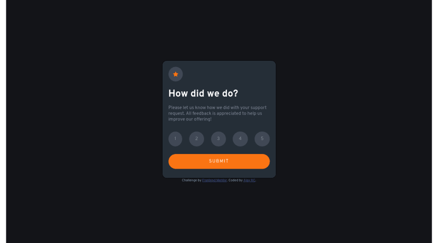
Design comparison
Solution retrospective
Guys, I will be very grateful to have any feedback on this challenge...
Community feedback
- @correlucasPosted over 2 years ago
👾Hi Ajay, congrats on completing this challenge!
I've just opened your live site and I can say that you did a great job putting everything together! There's some tips to improve your solution:
Your component is perfect, but is not responsive yet, this is due the
fixed widthyou've applied to the container.Look both
widthandmax-widththe main difference between these properties is that the first(width) is fixed and the second(max-width) isflexible, for example, a component withwidth: 320pxwill not grow or shrink because the size will be ever the same, but a container withmax-width: 320pxormin-width: 320pxcan grow or contract depending of the property you've set for the container. So if you want a responsive block element, never usewidthchoose ormin-widthormax-width.Note that there's no need to use
heighthere, because since you set aheightfor an element, this means that this element will grow until a certain point and after that the inner content (as texts or images) will start to pop out the element due its fixed height, so isn't necessary to set theheightthe container height comes from the elements, its paddings and height.✌️ I hope this helps you and happy coding!
Marked as helpful1@ajay117Posted over 2 years ago@correlucas thank you for your suggestion, I have changed "width" to 'max-width" And I had to use "height" so that I can place the card component at the center of the document.
0 - @elaineleungPosted over 2 years ago
Hi Ajay, well done in building this component! I think there are many things you did well, including making the component responsive, having optimal views, making everything functional with the JS, and having descriptive class names. I found your code to be clean and easy to read, so great job here!
I think the only suggestion I have is that instead of using
lifor the buttons, try to use either a button or radio inputs, as this would have with accessibility since these are control elements and can be used with the tab key, whereas thelielement could not be used with a tab key. Even though you can add make them into focusable control elements, there shouldn't be a need to do that when there are more suitable elements, such asbutton.Hope this helps and once again, great job!
Marked as helpful1@ajay117Posted over 2 years ago@elaineleung thank you for your feedback, really appreciate it...
1
Please log in to post a comment
Log in with GitHubJoin our Discord community
Join thousands of Frontend Mentor community members taking the challenges, sharing resources, helping each other, and chatting about all things front-end!
Join our Discord
