Design comparison
SolutionDesign
Solution retrospective
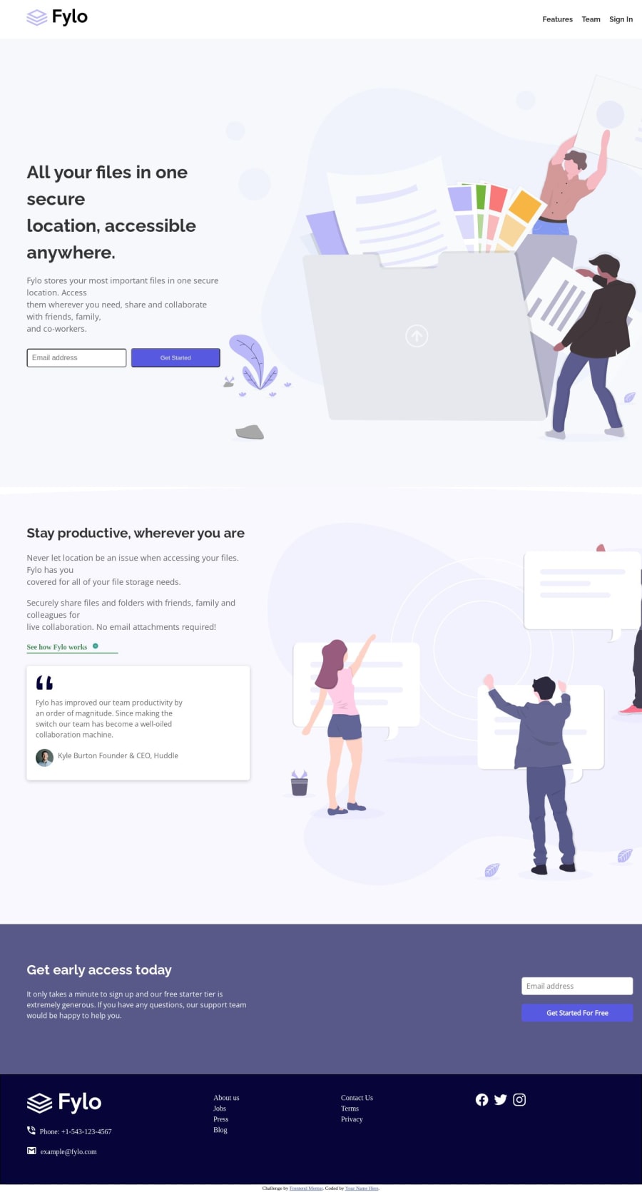
I think for the desktop version i managed to create something pretty close to the design. I haven't made a responsive version because i am yet to understood responsive design quite well
Community feedback
- @javascriptor1Posted over 1 year ago
Hi Andrewwangari ,
Good job. Here is my feedback on your solution :
- As you said, the design is not responsive and mobile design is broken. Best of luck learning responsive web design - it's fun and lots of challenges are waiting ahead.
- Take care of headings and text sizes in the design. For example, the main heading in the hero section [ All your files in one secure location, accessible anywhere] should be in 2 lines only as per design. But in your solution, it span in 4 lines.
- Social media icons in the footer should have a white circle and the color should change on hover state.
- For the nav menu in the footer, add space between each element. Also, the color should change on hover.
- See how Fylo works anchor tag color does not change on hover. Also, the border-bottom line goes beyond the element.
- Kyle Burton Founder & CEO, Huddle - The position should appear under the name.
- Email forms submit even when the email is not valid. You have not applied any validation to both forms.
I hope this would help. Keep coding 🚀
0
Please log in to post a comment
Log in with GitHubJoin our Discord community
Join thousands of Frontend Mentor community members taking the challenges, sharing resources, helping each other, and chatting about all things front-end!
Join our Discord