Not Found
Not Found
Not Found
Not Found
Not Found
Not Found
Not Found
Not Found
Not Found
Not Found
Not Found
Not Found
Not Found
Not Found
Not Found
Not Found
Not Found
Not Found
Not Found
Not Found

Submitted

flexbox, box-shadow, transition, justify-content, align-items, padding

P

@vlimbo

Desktop design screenshot for the Blog preview card coding challenge

This is a solution for...

  • HTML
  • CSS
1newbie
View challenge

Design comparison


SolutionDesign

Solution retrospective


What are you most proud of, and what would you do differently next time?

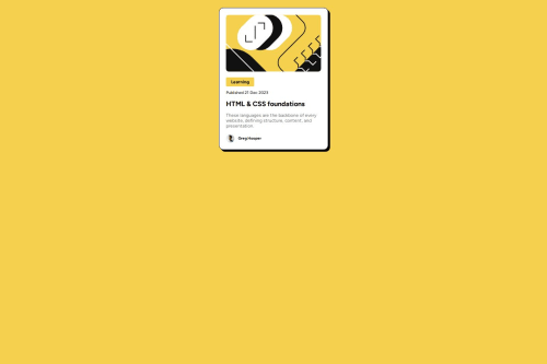
I think the part I'm most proud of from this was the process was the process I did when starting of the project itself, I took some time to plan it, and I got out the different elements in html before I started to fully style them, I was patient and focused on my layout using flexbox.

What challenges did you encounter, and how did you overcome them?

The absolute biggest ecounter was getting the flexbox to work properly. I am mostly familiar with using flexbox flex-direction: row, now I had to use the column value instead. The problem I had was that the paragraph container inside my main container stretched out to the whole line, making the actual box too big. I wanted the picture on top to determine the width of the box not the paragraph, so what I did was putting a max width on the paragraph and aswell using align items and justify content to make sure the paragraph elements only took up the necessary space and not the whole box vertically. Not sure which one of them do the prior though. Should figure that out.

What specific areas of your project would you like help with?

Yes I could not seem to figure out how they manage to do the transition when hovering with the mouse. I'm not reffering to the transition with the text, that is just using the color, but I am referring to the box shadow effect where it looks like the opacity goes from 1 to 0, and from 0 back to 1 and the box-shadow is in a new position.

Community feedback

@SvitlanaSuslenkova

Posted

I see you added flex, but your project didn't align to the center. The problem is you should add to your flex also min-height: 100vh; Currently, the height of the body is the same as the component in it.

I saw more cases when transition is added to the button(card here), not on it's shadow

Marked as helpful

1

P

@vlimbo

Posted

@SvitlanaSuslenkova Do center the entire container div in the middle of the body?

0

@SvitlanaSuslenkova

Posted

@vlimbo yes, make some experiments

Marked as helpful

0

@CrazyGreekGR

Posted

Nice job, it looks like a carbon copy of the challenge! To do the transition, you can add a transition property in the :hover element and set the value of it to something like 250ms. I am a beginner myself, so I can't help any further sadly. Keep going, you got this!

Marked as helpful

0

P

@vlimbo

Posted

@CrazyGreekGR Love the feedback! Yea the transition I will definitely check out, still really curious on how they managed to do it though

1
P
Steven Stroud 9,600

@Stroudy

Posted

Amazing job with this! You’re making fantastic progress. Here are some small tweaks that might take your solution to the next level…

  • Using a <main> tag inside the <body> of your HTML is a best practice because it clearly identifies the main content of your page. This helps with accessibility and improves how search engines understand your content.

  • Using a full modern CSS reset is beneficial because it removes default browser styling, creating a consistent starting point for your design across all browsers. It helps avoid unexpected layout issues and makes your styles more predictable, ensuring a uniform appearance on different devices and platforms, check out this site for a Full modern reset

  • While px is useful for precise, fixed sizing, such as border-width, border-radius, inline-padding, and <img> sizes, it has limitations. Pixels don't scale well with user settings or adapt to different devices, which can negatively impact accessibility and responsiveness. For example, using px for font sizes can make text harder to read on some screens, Check this article why font-size must NEVER be in pixels. In contrast, relative units like rem and em adjust based on the user’s preferences and device settings, making your design more flexible and accessible. Use px where exact sizing is needed, but prefer relative units for scalable layouts. If you want a deeper explanation watch this video by Kevin Powell CSS em and rem explained. Another great resource I found useful is this px to rem converter based on the default font-size of 16 pixel.

  • For future project, You could download and host your own fonts using @font-face improves website performance by reducing external requests, provides more control over font usage, ensures consistency across browsers, enhances offline availability, and avoids potential issues if third-party font services become unavailable. Place to get .woff2 fonts

  • Using max-width: 100% or min-width: 100% is more responsive than just width: 100% because they allow elements to adjust better to different screen sizes. To learn more, check out this article: responsive-meaning.

You’re doing fantastic! I hope these tips help you as you continue your coding journey. Stay curious and keep experimenting—every challenge is an opportunity to learn. Have fun, and keep coding with confidence! 🌟

0

Please log in to post a comment

Log in with GitHub
Discord logo

Join our Discord community

Join thousands of Frontend Mentor community members taking the challenges, sharing resources, helping each other, and chatting about all things front-end!

Join our Discord